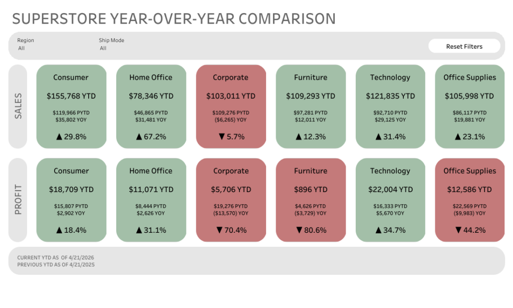
I’ve been wanting to try out one of Tableau’s newer features, rounded corners, so I decided to give one of my very first dashboards a refresh.
Let’s just say… I had a little too much fun with it! 🙂
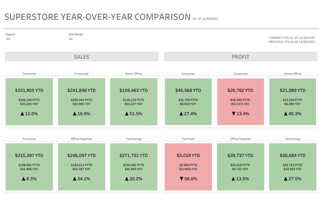
Before
After
The overall layout is pretty similar, but the feel is completely different. The rounded corners soften everything and make the dashboard feel more modern and a bit more approachable.
Did I go slightly overboard? Maybe. But that’s part of the fun of experimenting with new features.
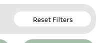
A simple trick I loved:
The highlight for me was the “Reset Filters” button.
It looks like a button, but it’s actually just a worksheet. No custom shapes needed.
Here’s what I did:
Created a worksheet with the text “Reset Filters”
Dropped it onto the dashboard
Layout pane > turned on rounded corners (25 degrees)
Adjusted the padding and background color
Added it to the dashboard and set up a dashboard filter action
That’s it. Now it looks and feels like a button, but it’s fully native and easy to maintain.
Why this matters
Small UI details can make a big difference in how a dashboard feels to use. Rounded corners, padding, and subtle styling tweaks can take something from functional to polished without changing the underlying data or logic.
Also… it’s just fun to revisit old work with fresh eyes (and new features).
Curious to hear what others think. Are you using rounded corners yet, or holding onto the classic sharp edges?
Addendum: Why Green & Red?
This design choice actually came from a real client use case.
The client felt strongly about using green for positive performance and red for negative performance. The goal of the dashboard was to provide quick, at-a-glance insight info where a segment or category was performing better or worse year over year.
So the color does a lot of the heavy lifting. You can scan the dashboard in seconds and immediately spot what’s up and what needs attention.
On the technical side, these “cards” are built using a shape mark type with the size maxed out so it fills the entire sheet. Then a simple calculation on color drives whether the mark shows as green or red based on performance.
Simple build, but really effective for this kind of use case.
A clean, scannable pattern for quick-insight dashboards
When you need to show how a total breaks down by segment, but don’t want users decoding legends or hovering for context, Labeled Segmented Bars are a great solution.
Also nicknamed At-a-Glance Bars, this pattern combines:
Segmented bars
Direct labels placed above the bar
A clean, minimalist design that reads instantly
This makes them ideal for executive summaries, KPI sections, and overview dashboards where speed and clarity matter.
In this post, I’ll walk through how to build this pattern step-by-step in Tableau.
What Are Labeled Segmented Bars?
A Labeled Segmented Bar uses two synchronized bars layered on top of each other:
A bottom bar that shows segments using color
A top bar that exists purely to display clear, readable labels
Because the labels sit above the segmented bar rather than inside it, insights are immediate, with no legends and no guesswork.
Step-by-Step: How to Build Labeled Segmented Bars
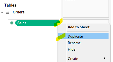
1. Duplicate Your Measure
Start by duplicating the measure you want to visualize.
In this example, I’m using Sales
Create a duplicate field called Sales (Copy)
This duplicate allows us to layer two bars with different formatting.
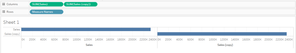
2. Place Both Measures on Columns
Drag Sales to the Columns shelf
Drag Sales (Copy) to the Columns shelf as well
You should now see two bars side by side.
3. Add Measure Names to Rows
Drag Measure Names to the Rows shelf
This helps Tableau manage the layered view once we switch to a dual axis.
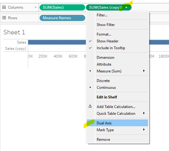
4. Stack the Bars Using Dual Axis
Now we’ll layer the bars on top of each other.
Click the drop-down arrow on Sales (Copy)
Select Dual Axis
You should now see the bars overlapping.
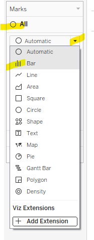
Note: When you select Dual Axis, Tableau will often default the marks to a Circle mark type. If this happens:
Go to the All Marks card
Change the mark type from Automatic to Bar
This ensures both layers render correctly as bars before you continue.
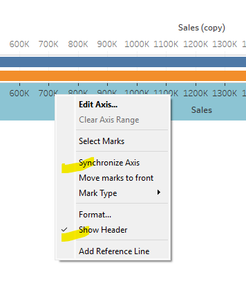
5. Synchronize and Clean the Axis
Right-click on one of the axes → Synchronize Axis
Right-click again → uncheck Show Header
This keeps both bars perfectly aligned and removes unnecessary axis clutter.
Formatting the Bars
At this point, you’ll have three Marks cards:
All
Sales(top bar)
Sales (Copy)(bottom bar)
We’ll use each Marks card intentionally to control the final look.
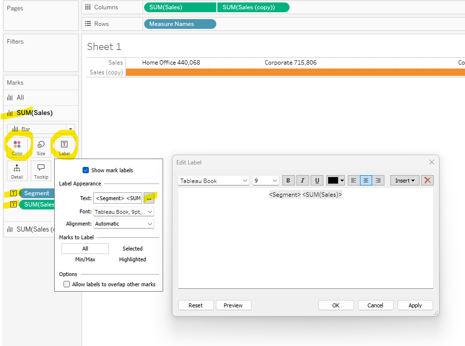
6. Format the Top Bar (Labels Only)
The top bar exists only to display labels.
On the Sales Marks card:
Set Color to White
Remove borders (no outlines)
Add Segment to Label
Add Sales to Label. Remember to format numbers. In this case we want $$ for Sales. Right click on the green pill, select Format and then set the formatting using pane on the left side.
Edit the label text so Segment and Sales appear side by side (Tableau defaults to placing them on separate lines)
This creates clean, readable labels that float above the segmented bar.
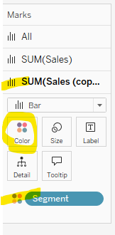
7. Format the Bottom Bar (Segmented Color)
The bottom bar provides the visual segmentation.
On the Sales (Copy) Marks card:
Place Segment on Color
This bar shows the proportional breakdown by segment. Assign a color palette as desired.
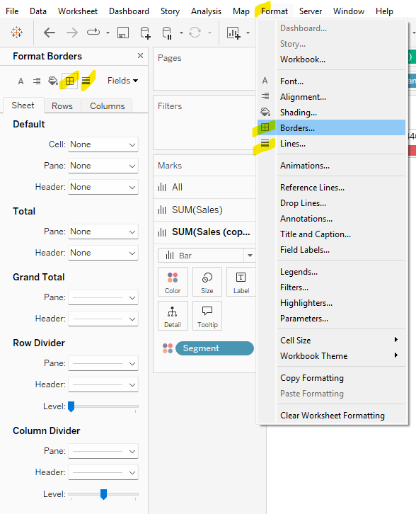
8. Final Formatting Cleanup
For a polished, dashboard-ready finish:
Go to Format → Borders
Remove all row and column borders
Go to Format → Gridlines
Remove all gridlines and dividers
This keeps the focus entirely on the bars and labels.
When to Use This Pattern
Labeled Segmented Bars (At-a-Glance Bars) work best when:
You want users to understand values instantly
It’s important that labels remain readable regardless of color selection
Legends would slow down interpretation
The chart supports a summary or overview, not deep analysis
Common use cases include:
Sales by segment
Revenue by category
Headcount by department
Any “how does this total break down?” question
Final Thoughts
This pattern is simple to build, easy to reuse, and incredibly effective for dashboard communication.
By separating visual segmentation from label readability, Labeled Segmented Bars help users get the message at a glance — exactly what good dashboard design should do.
Hey #DataFam! Let’s give a warm welcome to our guest blogger this month, Caroline Swiger! We’re excited to feature her fantastic write-up on Custom Themes—a must read! Dive in and enjoy Caroline’s insights!
Save Time with Custom Themes!
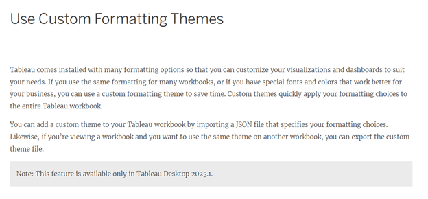
Are you constantly looking for ways to save time? I think the answer for most of us is a resounding yes – in life, work, & vizzing! I have been (not-so) patiently waiting for Custom Themes since #TC24, and with Tableau 2025.1, it is finally here! Read on to hear about my first experience with this new feature!
What are themes?
Themes refers to all stylistic and formatting choices made within a workbook. “Themes” have existed in Tableau for some time, but they never really did what people wanted, and have been largely ignored.
Most of my workbooks, particularly at work, begin with time spent formatting the workbook. I change the default font & sizes, turn off grid lines, & turn on a thicker zero line. It is a small investment that saves me time, but one that I repeat for every dashboard. The formatting options at the workbook level are also limited; I always find myself spending considerable time formatting throughout the viz process, from tooltips to charts to the dashboard itself.
What are Custom Themes?
The Tableau Desktop & Web Authoring guide describes custom themes as the ability to quickly apply formatting choices like fonts and colors to an entire Tableau workbook via a JSON file.
What style elements are supported?
There are 20 style elements available in Tableau that are currently supported for custom themes in Tableau 2025.1. They include:
Style Element
Description
Style Attributes
all
Formats all fonts across the entire workbook.
Font – color
Font – family
worksheet
Formats the worksheet default font.
Font – color
Font – family
Font – size
worksheet-title
Formats the worksheet title font.
Font – color
Font – family
Font – size
tooltip
Formats the tooltip font.
Font – color
Font – family
Font – size
dashboard-title
Formats the dashboard title.
Font – color
Font – family
Font – size
story-title
Formats the story title font.
Font – color
Font – family
Font – size
header
Formats the header font.
Font – color
Font – family
legend
Formats the legend body font & background color.
Font – color
Font – family
Font – size
Background – color
legend-title
Formats the legend title font on all worksheets.
Font – color
Font – family
Font – size
filter
Formats the filter body font & background color on all worksheets.
Font – color
Font – family
Font – size
Background – color
filter-title
Formats the filter title font on all worksheets.
Font – color
Font – family
Font – size
parameter-ctrl
Formats the parameter body font & background color on all worksheets.
Font – color
Font – family
Font – size
Background – color
parameter-ctrl-title
Formats the parameter control title font on all worksheets.
Font – color
Font – family
Font – size
highlighter
Formats the highlighter body font & background color on all worksheets.
Font – color
Font – family
Font – size
Background – color
highlighter-title
Formats the highlighter control title font on all worksheets.
Font – color
Font – family
Font – size
page-ctrl-title
Formats the page card title font on all worksheets.
The Tableau documentation online includes example code that could be used to create the JSON custom theme file. My background is not coding-heavy, so I decided to:
Create a simple viz using style elements supported with custom themes,
Export my own custom theme, &
Import it to a new workbook to see how well it worked!
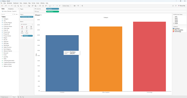
Step 1: Format worksheet
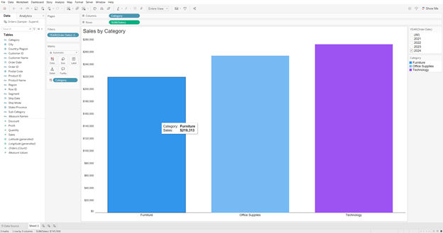
Here is the simple Superstore worksheet I created:
Style choices made at the workbook-level (those supported by custom themes have a ✅!):
Color legend: Title – 11pt✅, #1b1b1b✅; Body – 11pt✅, #1b1b1b✅
Filter and Set Control: Title – 12pt✅, #1b1b1b✅; Body – 11pt✅, #1b1b1b✅
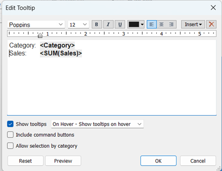
Tooltips: 12pt✅, #1b1b1b✅, Bold variables
Admittedly, this is not an extensive list of formatting choices on my part – just 23; 27 if you include the tab in the tooltip, deselecting the command buttons & allow selection by category options, & choosing to show tooltips on hover. I anticipated that custom themes would cover 17 of them – not too shabby if all went well.
Step 2: Export custom theme
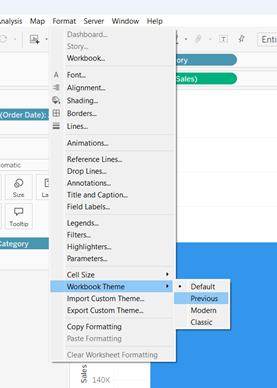
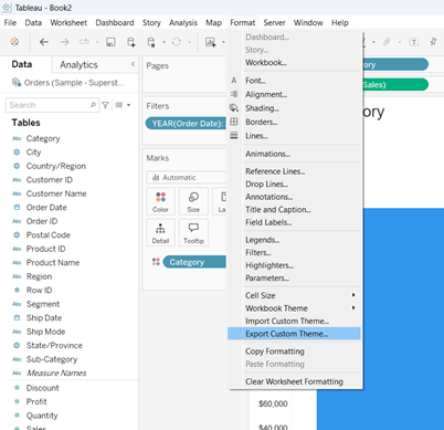
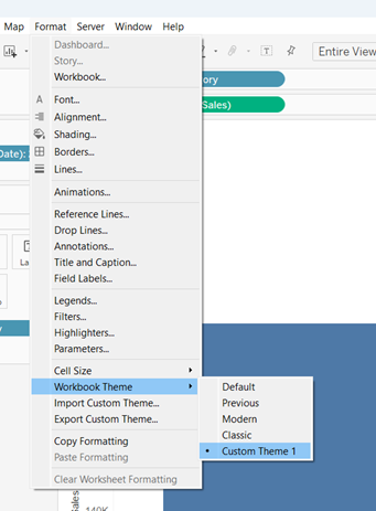
After formatting my worksheet, I went to Format > Export Custom Theme… and saved it in My Tableau Repository as ‘Custom Theme 1.json’ (original 😂).
Step 3: Recreate worksheet in new workbook & import custom theme
I opened a fresh workbook & recreated the basic view without adjusting any of the default formatting.
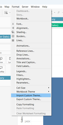
Then, I went to Format > Import Custom Theme… and selected ‘Custom Theme 1.json’ from the list.
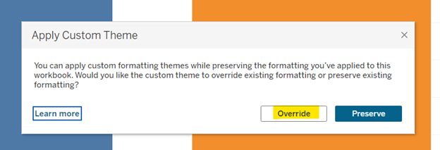
When the Apply Custom Theme message popped up, I clicked Override.
Drum roll, please…
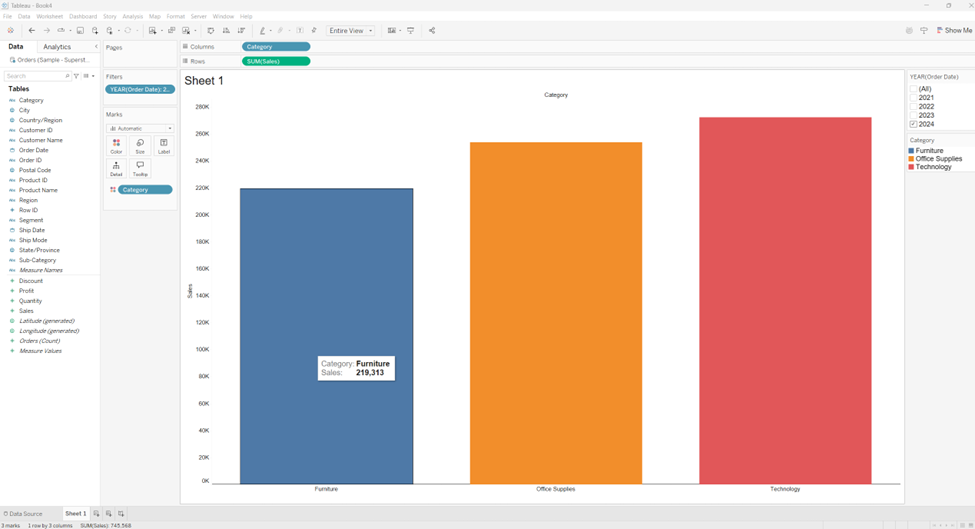
And here is the resulting worksheet with my very first custom theme applied!
So how did it do?
Style Element
Success?
Workbook font = Poppins
✅
Grid lines = off
✅
Zero line = solid
✅
Zero line = 1pt
✅
Zero line = #1b1b1b
✅
Worksheet-title = 18pt
Font size remained default 15pt
Worksheet-title = #1b1b1b
✅
Color legend (title) = 11pt
✅
Color legend (title) = #1b1b1b
✅
Color legend (body) = 11pt
✅
Color legend (body) = #1b1b1b
✅
Filter & set control (title) = 11pt
✅
Filter & set control (title) = #1b1b1b
✅
Filter & set control (body) = 11pt
✅
Filter & set control (body) = #1b1b1b
✅
Tooltip font = 12pt
Font size remained default 10pt
Tooltip font = #1b1b1b
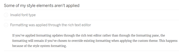
Partial credit? The headers remained the default gray but the variables were #1b1b1b (maybe this is all it applies to?) But extra credit for maintaining my tab! I will take it!
I looked at the troubleshooting guide because it was probably me & not Tableau 😉.
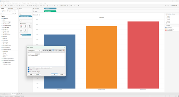
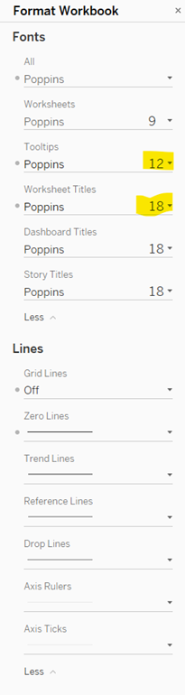
Aha! The key is to use the formatting pane:
I exported & imported again with success! 17/17 expected style elements present!
Hey, look! Now my highly original name for my very first custom theme appears in the list of options! Neat!
Final thoughts
I am excited about the initial release of custom themes and pumped for my organization to upgrade to 2025.1 so I can create my standard template go-to. What may have been 20+ clicks is now just one, and that is awesome.
Custom themes may not be a radical time saver yet, but it has so much potential. Can you imagine if you were able to choose more of your own defaults? Sit down to start a viz and import a theme where all the styling is suited to your preferences, down to the charts? I can hear a choir of angels singing now…
Make your text tables on dashboards shine with an easy, interactive, custom sort order feature.
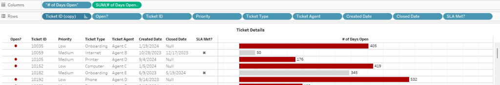
The concept is simple: give your dashboard viewers a handy-dandy drop-down menu so they can sort their table with the rows of most importance to them at the top. I deployed this technique on my Help Desk Dashboard – click here to see it in action.
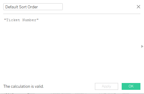
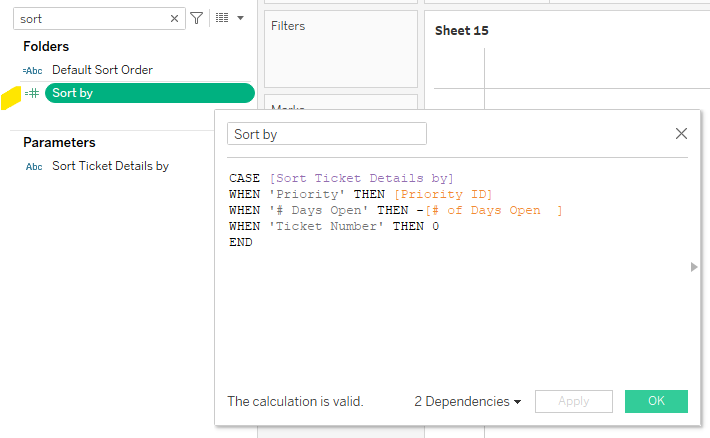
Begin by building your text table and determining the various ways in which the table can be sorted. For my Help Desk Dashboard, I chose Ticket Priority, # of Days Open, and Ticket Number. I also wanted to be sure the table always defaulted to show the rows by Ticket Number when the workbook is opened. Once you’ve established these values, you can create a calculation to set the default value and a parameter with the list of sort options.
Note the Default Sort Order calculation appears in the “Value when workbook opens” spot in the parameter.
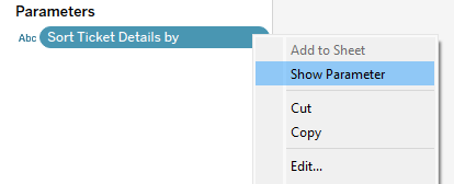
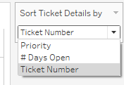
Once the parameter is created, you can show the parameter and take a sneak peak at the appearance of the toggle.
Looks good! We are now ready for our next step, which requires us to use this parameter in a calculation. A CASE statement works beautifully in this step.
With this calculation, we are asking Tableau to do the following:
When the toggle is set to Priority, Tableau will check the Priority ID and sort by this value. For your reference, the Priority ID in this dataset assigns High Priority the value of 20, Medium is 30, and Low is 40. For the rows to be listed from High to Low, we will want to use this calculation in Ascending Order: 20-30-40 (Tuck away that thought for later!)
When the toggle is set to # of Days Open, we want Tableau to reference a calculation by the same name that counts the difference in days between Created Date and Closed Date, or in the case of tickets still open, the difference between Created Date and Today. Now, recall that we will be using this calculation in Ascending Order per the note above regarding Priority. This means we must place a negative sign in front of # of Days Open in order for the tickets with the longest # of days open to appear at the top. For example, if a ticket has been opened for 35 days, it will appear above a ticket that has only been opened for 2 days if we assign it a negative value (ascending order is -35 then -2).
And last but not least, when the toggle is set to Ticket Number, we want Tableau to return a 0. Why? We built our text table with Ticket Number as the first value on the Rows shelf, so Tableau will use this value to sort the orders because our Sort Order calculation assigns a 0 to all rows in this setting.
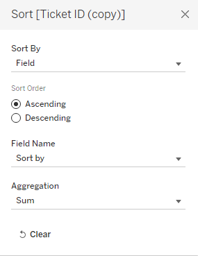
Last but not least, we need to activate this calculation by accessing the drop-down from the Ticket Number field on the rows shelf > Sort and follow the prompts to select the Sort Order field and Ascending order.
So there you have it – with a couple of calculations and one parameter, you can add interactivity to your text table and give the dashboard viewer the control to see the rows of data in the order most relevant to them!
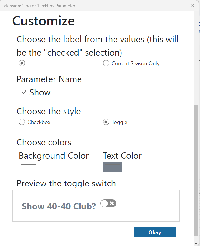
Toggle buttons are a great way to add interactivity to a dashboard, and Tableau’s Single Checkbox Parameter dashboard extension is a quick & easy way to do so!
This got me thinking: if this dashboard extension is new to me, it may be new to others as well. And with that idea, a blog post was born!
Before we jump into the “how-to” part of this blog post, there are two things you should know.
First, a note about the name. “Single Checkbox Parameter” is slightly misleading. It can be a checkbox, but it can also be displayed as a toggle button as shown in Fredrick’s viz and the method I chose for my viz as well. The key point to emphasize is that this extension allows for single selection only, meaning only one item can be true at any given time.
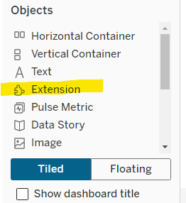
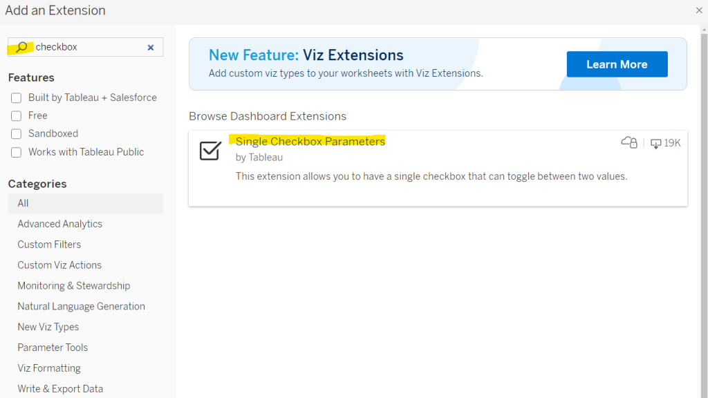
Second, you may be wondering what exactly are dashboard extensions anyway??? Dashboard extensions allow you to add features to a dashboard as you would add standard objects to a dashboard, and can be found in the left bottom corner of the Dashboard pane, under “Objects’.
When you drag the Extension object on to a dashboard, a dialog box appears. I used the search box to find the Single Checkbox Parameters extension. Click on this item and follow the prompts to add it to your dashboard.
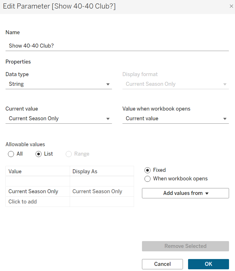
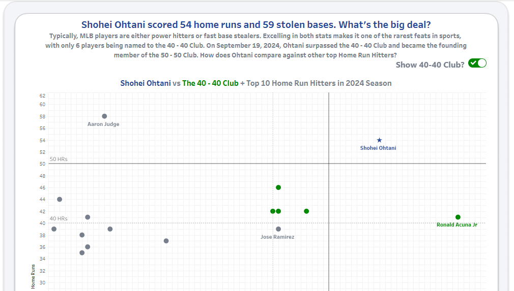
In the case of the Single Checkbox Parameter, you will need a parameter set up before adding the extension to your dashboard. Let’s take a closer look at how I did this for my Ohtani vs Top Home Run Hitters viz. For this dashboard, I wanted the audience to have the ability to show or hide the Top 40 Club. To do this, I created a parameter [Show 40-40 Club?] with a string data type and a specific List of Allowable Values. You’ll notice in this screenshot the first item in my list is actually a space, instead of ‘Show 40-40’. I used a blank space to accommodate formatting choices later on in the design process.
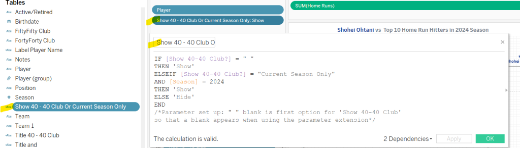
Next, I used this parameter in a calculated field, and placed this calculation on the Filter Shelf set to Show.
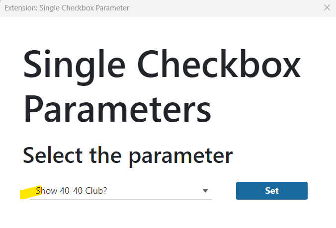
With these items in place, I was now ready to add this sheet to my dashboard, along with the Single Checkbox Parameter extension object. Following the prompts, Tableau will ask you to confirm the parameter you wish to use.
Tableau also provides you with some options to customize the appearance of the extension. This is where you will find the option to choose between the checkbox or the toggle. I chose to display the parameter name, toggle style, and selected a white background with grey text color.
Presto! A toggle button that adds interactivity without having to create a custom shape or image.
With the latest 2024.3 release, Tableau has rolled out a new viz extension called, “Tableau Table”. I took it for a spin and was delighted to find some very exciting features! Here’s a quick walkthrough with some key differentiators that make this viz extension a game-changer.
To begin, you can access this feature by clicking on the Marks Card on a new sheet, and selecting +Add Extension.
A dialog box will open and you will find it listed under the ones “Built by Tableau + Salesforce”.
Once you click on Tableau Table, a window appears with additional information. Click Open to proceed. We are now ready to begin building our table.
Begin building your table by dragging both the dimensions and measures to the details card. You can add them in any order you wish – measures can be before or after dimensions. This is pretty revolutionary. With a traditional crosstab build, all dimensions must be on rows, and therefore appear on the left in the table “header”. Measure Names would be on columns with Measure Values on text, forcing all measures to appear to the left of the dimensions. I’ve come across several real-world examples when there has been a need for a dimension to be mixed in together with measures. In this use case example, you can see I’ve placed Ship Date (a dimension) after SUM(Sales) (a measure).
You can rename column headers to be more intuitive. In this example, I’ve renamed SUM(Sales) to Order Amt $.
It is also possible to format each column independently with a few easy steps. Click on the drop-down menu button beside the column name, select Format. This opens a formatting dialog box. Here you have a few choices on how you wish the data to be displayed – for example, you can change it to be data bars, and you can apply rules to format the color and font. Note, if you change your mind and want to revert back to the original formatting, the back arrow won’t work. You need to access the drop-down menu again and select “Clear Formatting”. It’s also worthwhile noting there are other options here as well, including specifying how to sort the data.
Last but not least, you can customize the overall appearance of the table by accessing the ‘format’ button on the toolbar.
This opens a dialog box with several options, including adding filters under each column header, and the ability to add “Show Excel Download” button. This feature in itself is the golden nugget – in most real-world use cases, the purpose of building a text table similar to this would be to provide a validation spreadsheet for end-users. The excel download button is a dream – with one click, the end-user has a spreadsheet AND the formatting carries over as well. Brilliant!
Here’s an example of my formatted Tableau Table:
And a screenshot of the ‘downloaded to Excel’ version:
Unfortunately it is not possible to publish this to Tableau Public (yet) but if you’d like to see my workbook with this Superstore example, I’d be more than happy to send it to you! I think you’ll find it very intuitive and easy to build. Well done, Tableau!
Exciting news to share – I recently passed the Tableau Certified Data Analyst Exam!
For those of you not familiar with this certification, it is offered by Tableau and is valid for two years. Since mine had expired and my employer required it to be renewed, I found myself back in study-mode to prepare. There are several excellent resources available online – here’s a list of my go-to’s:
This link provides an overview of exam format, grading, and sections to be covered on the exam. Note: the exam is in three sections, and once you complete a section you cannot return to it later. Be sure to review each section before pressing “Finish” and moving on to the next section. The exam is closed-book, meaning you cannot search for answers online, or login to Tableau to verify. There is one hands-on section which requires you to complete tasks within Tableau Desktop.
This is website provides handy links to Tableau documentation for all sections of the exam. I found Domain 1 focused quite a bit on Tableau Prep and Custom SQL, so if you mainly use Tableau Desktop in your daily work, be sure to review these concepts.
Practice Questions and Exam Overview
This is the perfect resource to review a sample of typical exam questions and familiarize yourself with the format. The wording of questions and multiple-choice answers can sometimes be tricky, so practicing ahead of time is well worth the effort! During the exam I reviewed all of my answers, which was helpful as I caught a couple that needed correcting after re-reading the question.
#Datafam blog posts from CJ Mayes, featuring Deborah Simmonds and Mehras Abdoli, and Ann Pregler
Last but not least, this round-up would not be complete without mentioning these #Datafam links – my go-to’s for learning all things Tableau, 365 days of the year!
Overall, I found the experience to be challenging and reaffirming. It gave me an opportunity to brush up on some concepts I don’t use daily and it was a good test of my Tableau knowledge. Please feel free to reach out if you are planning to take the exam – happy to share my tips & knowledge!
For folks who download crosstabs from Tableau dashboards, this tip is for you!
To demonstrate this tip, let’s use a simple crosstab with Superstore data.
To begin your download, simply click the download button and select crosstab.
Once you select Crosstab, you are presented with a few additional options: The sheets you wish to download, and a choice between Excel or CSV file formats.
This is where the fun begins! If you select Excel, your download file will be formatted the same way it appears in Tableau. Notice the merged cells in this screenshot:
Alternatively, the CSV format populates each column & each row with the corresponding data. In other words, without merged cells.
Did you know there is more than one setting for displaying tooltips?
The default setting, Responsive, triggers the tooltip immediately upon hovering the mouse over the mark in the visualization.
This default setting can be adjusted to Hover, which introduces a slight delay before the tooltip appears. Choosing Hover instructs Tableau to pause briefly before displaying the tooltip popup. This option is particularly useful in visualizations with numerous marks, such as a busy scatterplot, where the Responsive setting may inundate users with tooltips popping up instantly as the mouse moves across the screen.
To switch to the Hover setting, simply click on the dropdown menu within the Tooltips editor box.
But wait, there’s more! There’s a third method to activate tooltips, which I’ve nicknamed “Click Action Tooltips”. This approach involves utilizing a parameter, a handful of calculations, and dashboard parameter actions. Once implemented, tooltips appear when a dashboard user clicks on a mark in the visualization. This is extremely helpful in a crosstab text table with multiple rows of data – no more distracting popups as the mouse scrolls …instead the dashboard user has the control to make the tooltip appear with a simple click action! Check out my demo dashboard on Tableau Public to take it for a test drive and view how-to-build instructions. Feel free to download & reverse-engineer to make it your own!
Text tables are a common request; often dashboard viewers want to see the rows of data to verify, which in turns builds trust. This is especially true for organizations moving away from traditional spreadsheets to interactive and automated dashboards. Thankfully, there are several techniques that can elevate text tables from good to great, especially when it comes to formatting Sub-Total and Grand Total rows. Read on to learn three quick & easy techniques.
Rename the header
Click on the Total or Grand Total row and select “Format” from the drop-down menu. This opens a formatting pane on the left, which allows you to type in a custom header for your Total and/Grand Total rows. In this example, I’ve renamed Total as Sub-Total, and Grand Total as Total (All Categories).
Highlight with Color
To draw attention to the total rows, you can customize the shading. To help with comprehension, you can select one color for Sub-Totals, and a different, contrasting color for Grand Totals.
Bold Fonts
Finally, a tried & true method to draw attention to the total rows? Bold the font.
Text tables may not have the pizzaz of a scatterplot or Sankey, but they can still be visually appealing.