Build Your Own Crosstab: from concept to final build

My “Build Your Own Crosstab” Dashboard empowers Tableau Viewers to customize their experience by selecting and arranging the columns in their crosstab, based on their preferences. The inspiration for this dashboard came from hearing a user express frustration over not being able to reorder columns. This feedback made me pause and ask: Could this be possible? Read on to discover how this idea transformed into a fully functional solution.

Step 1: Pen & Paper

This dashboard began with one of my go-to techniques: pen and paper sketching. It’s not only essential for designing the layout but also for working through the technical aspects. In this case, I knew I wanted to incorporate parameters, parameter actions, and dynamic zone visibility. Figuring out how all these elements would interact took some serious brainstorming—and plenty of doodling!  Here are some examples of my early sketches: 

Step 2: Building in Tableau

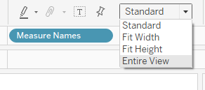
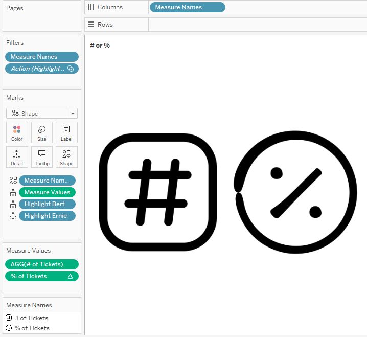
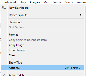
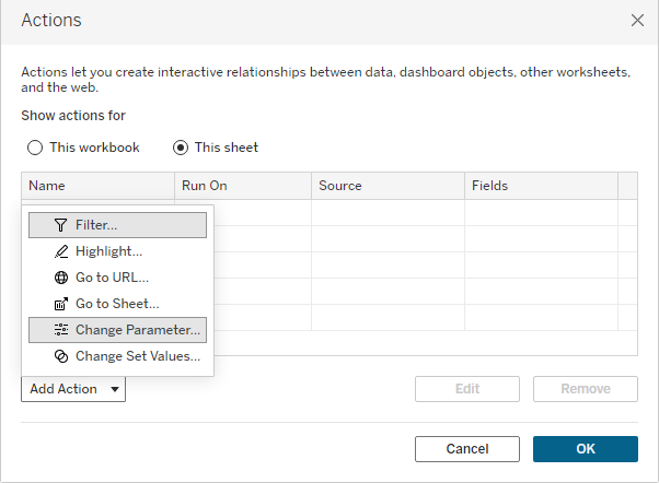
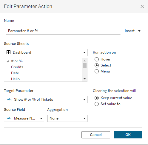
With my wireframe sketches and notes at hand, I turned to Tableau. Once connected to Superstore data, I began building out the parameters and calculations I would need to run the dashboard. I built the necessary sheets, began the dashboard build (Horizontal and Vertical containers are key for this one!), and got to work on implementing dynamic zone visibility and parameter actions. 

Step 3: Solicit Feedback

With a working prototype ready, it was time to ask for feedback. I published the dashboard to Tableau Public as a hidden viz, and shared the link with trusted colleagues in the #DataFam. I also brought the concept to #VizOfficeHours, held once a week by Michelle Frayman, Nicole Klassen, and Zak Geis. Having a fresh set of eyes helped me gauge the intuitiveness & functionality. With a few minor tweaks I was able to incorporate the feedback and switched the viz’s visibility from hidden to “Show Viz on Profile”. 

If you’d like to take the dashboard for a test drive, you can find it on my Tableau Public profile. When you explore it, you’ll notice two key features: the Date field is mandatory (with no option for “no selection”), and all values appear on every row rather than being nested by column 1, as in a traditional Tableau crosstab. These were intentional design choices I set at the start of the project. Since this is a prototype, not built to spec, I established these requirements to give myself a clear framework to work within.

Happy Vizzing!

The ‘help’ behind the Help Desk Dashboard

As a data visualization consultant, having proof-of-concept dashboards is essential for discussing the types of visualizations we want—or, more importantly, don’t want—when starting a new project. The biggest challenge, however, is finding a clean, anonymized dataset to build these demo dashboards. That’s where Tableau Community Projects, like RealWorldFakeData (RWFD), come in handy. RWFD is a treasure trove of business-related datasets.  A more recent initiative, Adam Mico’s Data Mockstar, is incredibly useful as well. This ChatGPT tool allows you to specify the desired columns and it returns a dataset of randomly generated data. For my Help Desk Dashboard, I decided to take Data Mockstar for a test drive. With just a few clicks and the following prompt, I had a mock dataset in csv format ready to use for my demo dashboard.

Brilliant! I connected Tableau Desktop to the csv file provided by Data Mockstar and began an initial data discovery to determine the best way to visualize the data (hello, bar charts). Early in the process, I realized that the analysis relies heavily on date fields—specifically, Ticket Created Date and Ticket Closed Date. The mock dataset contains two years of daily data (2023 and 2024, per my specifications), which is fine for now. However, to future-proof this dashboard, I needed to shift the rows of data so that it always includes two years up to and including today, rather than a fixed period from January 1, 2023, to December 31, 2024. Shoutout to Andy Kriebel, whose Next-Level Tableau Program inspired the set of calculations needed to perpetually shift the dates. 

The end result? A dynamic dashboard that appears to update “live” even though the data source is a flat file generated once. You can find the dashboard on my Tableau Public profile page—feel free to download it and take a look under the hood!

Happy Vizzing! 
#B2VB Challenge: HBCU College Finder Text Table

As a mom of two high schoolers, B2VB’s week 3 college-related data set caught my eye. With a plethora of higher-education choices available, wouldn’t it be great if we could generate a list of colleges based on a specific set of criteria? With this idea in mind, I decided to build a text table that could be modified based on the input provided and give the end-user the ability to sort the list based on their priorities.

With a little “data discovery”, I found fields in the data set for In-State Tuition and Out-of-State Tuition. Bingo! Just the perfect data to put my idea into action. Afterall, isn’t Cost one of the first things families consider when making a short list of colleges?  To make the dashboard user-friendly, I decided to call this out as the first step – selecting the State you live in – using a bold font with an arrow (created in Figma). This bit of information provides the input to display either In-State or Out-of-State $$. To accomplish this, I needed to modify the data source, build a parameter, and write a calculation. 

The Data Source

The data set provided had the list of colleges, but no States. With a little bit of effort (thanks, Google!) I was able to add a column to indicate the State for each College. To answer the question regarding tuition (In-State vs Out-of-State), I also needed a way to provide the dashboard user with an input for the State they reside. This required adding another table to the data model – a full list of States. This was accomplished using a right join in the Data Source tab.  

The Parameter

Next, I created a string parameter called “Where Do You Live?” and populated it with the values from the full list of States.  

The Calculation

Next, I created a calculated field that uses the parameter to tell Tableau if it should pull the value for the In-State or Out-of-State tuition.  This calculated field was brought into the view as one of the measures in the text table.

I followed similar steps for the Undergrad/Grad selector, using a parameter and calculated field to display the student population based on the dashboard user’s selection.

Here’s a link to the final result on my Tableau Public Profile – take it for a test drive and let me know what you think! The dashboard incorporates a few other techniques as well – stay tuned for a follow up blog post with more details.

Thank you to #Back2VizBasics and the #Datafam for these community challenges that help us stay current with our Tableau skills.

Happy Vizzing! 

Tableau Certified Data Analyst – Exam Resources

Exciting news to share – I recently passed the Tableau Certified Data Analyst Exam! 

For those of you not familiar with this certification, it is offered by Tableau and is valid for two years. Since mine had expired and my employer required it to be renewed, I found myself back in study-mode to prepare. There are several excellent resources available online – here’s a list of my go-to’s: 

Tableau’s Exam Guide

https://www.tableau.com/learn/certification/tableau-certified-data-analyst-exam-guide

This link provides an overview of exam format, grading, and sections to be covered on the exam. Note: the exam is in three sections, and once you complete a section you cannot return to it later. Be sure to review each section before pressing “Finish” and moving on to the next section. The exam is closed-book, meaning you cannot search for answers online, or login to Tableau to verify.  There is one hands-on section which requires you to complete tasks within Tableau Desktop. 

Study Guide from Learning Tableau

This is website provides handy links to Tableau documentation for all sections of the exam. I found Domain 1 focused quite a bit on Tableau Prep and Custom SQL, so if you mainly use Tableau Desktop in your daily work, be sure to review these concepts. 

Practice Questions and Exam Overview

This is the perfect resource to review a sample of typical exam questions and familiarize yourself with the format. The wording of questions and multiple-choice answers can sometimes be tricky, so practicing ahead of time is well worth the effort!  During the exam I reviewed all of my answers, which was helpful as I caught a couple that needed correcting after re-reading the question.

#Datafam blog posts from CJ Mayes, featuring Deborah Simmonds and Mehras Abdoli, and Ann Pregler


Last but not least, this round-up would not be complete without mentioning these #Datafam links – my go-to’s for learning all things Tableau, 365 days of the year!

Andy Kriebel

Sqlbelle

TableauTim

The Flerlage Twins

Felicia Styer

Kim Unger

Bridget Cogley

Summary

Overall, I found the experience to be challenging and reaffirming. It gave me an opportunity to brush up on some concepts I don’t use daily and it was a good test of my Tableau knowledge.  Please feel free to reach out if you are planning to take the exam  – happy to share my tips & knowledge! 

Pep Talk Generator: Life is hard, giving yourself a pep talk doesn’t have to be.

Growing up, my dad gave me the best pep talks. One of his favourties was “Keep your stick on the ice.” Not surprising given his lifelong love of hockey. My Dad passed in 2013, and I miss his pep talks. This pep talk generator helps to partially fill that void, and it is one way I can share the joy he found in lifting others up.

So, let’s get down to the Tableau part, shall we? Building this pep talk generator in Tableau required using a variety of Tableau techniques — here’s a peek under the hood:

Each pep talk is composed of four separate string values. This gives the dashboard over 100,000 possible pep talk combinations. To offer the choice between the create your own pep talk or randomly generated pep talk, I employed parameters & calculated fields. There are four string calculations for the create your own and another four calculations for the random version.  For those of you keeping score at home, that makes eight calculations.

Pretty straight forward so far, agreed? Feel free to download the workbook from Tableau Public and follow along if you wish!

Both versions of the pep talk generator – create your own and randomly generated – use parameter values in the string calculations to change the text that is shown. Create your own has four parameters, one for each string calculation. Random also has four parameters, one for each string calculation. (Add 8 parameters to the score sheet!) However, the method by which these parameter values are updated differ. Let me explain:

For the Create Your Own version, the values in the parameters are updated using Tableau’s parameter control boxes, which are visible to the dashboard user.  In other words, when the dashboard user interacts with the parameter control box, the value in the parameter changes and updates the string calculation for that portion of the text.

The randomized version also uses four parameters, one for each string calculation, however, these parameters update when the workbook is opened using a different set of calculations. The “default when workbook opens” calculations utilize the function RANDOM() to randomly assign a value between 1-18. 

For those of you keeping score at home, we now have 12 calculations and 8 parameters. Could this be done with fewer calculations? Yes, probably. In fact you could combine the string calculations and thereby reduce the number of calculations, but I prefer having simpler, shorter syntax over nested calculations.

Now that we have the mechanism by which both sets of string calculations will update, and we can use these calculations to build the sheets by placing them on the text marks card. I used two separate sheets, one for the create your own pep talk, and a second one for the random version. I also built two more sheets which I named “button random” and “button create your own” that are used on the dashboard to toggle between the two versions.

You may be wondering how does the dashboard know which sheets to display? Dynamic Zone Visibility and Parameter Actions, FTW!  To employ these techniques, the dashboard utilizes another parameter with two values: Random or Create Your Own, to identify the components needed for each version. The components are as follows:

> four sheets: randomly generated text, create your own text, button random, button create your own

and

> four parameter control boxes that drive the create your own version

On the dashboard, you must assign the “Control visibility using value” to each component, or in the case of the parameter control boxes, the container that holds the components. Lastly, parameter actions drive these components (aka zones) to update dynamically when the dashboard viewer clicks on the “button” sheets. Naturally, there are a few more calculations needed to achieve this functionally, as well calculations for formatting the tooltips – all in, the total number is 22 calculations and 9 parameters! It sounds like a lot, but with consistent naming and a well-laid out plan, the dashboard build is very do-able.

I hope this Pep Talk Generator lifts you up and gives you the motivation to keep going. And if you know someone that needs a pep talk, please pass it on. http://tinyurl.com/peptalkgenerator

Viz built by: Sarah Pallett. Inspiration: David Pallett

Tableau Tip: Download Crosstabs

For folks who download crosstabs from Tableau dashboards, this tip is for you!

To demonstrate this tip, let’s use a simple crosstab with Superstore data.

To begin your download, simply click the download button and select crosstab.

Once you select Crosstab, you are presented with a few additional options: The sheets you wish to download, and a choice between Excel or CSV file formats.

This is where the fun begins! If you select Excel, your download file will be formatted the same way it appears in Tableau. Notice the merged cells in this screenshot:

Alternatively, the CSV format populates each column & each row with the corresponding data. In other words, without merged cells.

Voilà! Two options for downloading crosstabs. If you’d like to take this tip for a test drive, you can find my Tableau workbook published on Tableau Public.

Happy Vizzing!

Tableau Tip: Click Action Tooltips

Did you know there is more than one setting for displaying tooltips?

The default setting, Responsive, triggers the tooltip immediately upon hovering the mouse over the mark in the visualization.

This default setting can be adjusted to Hover, which introduces a slight delay before the tooltip appears. Choosing Hover instructs Tableau to pause briefly before displaying the tooltip popup. This option is particularly useful in visualizations with numerous marks, such as a busy scatterplot, where the Responsive setting may inundate users with tooltips popping up instantly as the mouse moves across the screen.

To switch to the Hover setting, simply click on the dropdown menu within the Tooltips editor box.

But wait, there’s more! There’s a third method to activate tooltips, which I’ve nicknamed “Click Action Tooltips”. This approach involves utilizing a parameter, a handful of calculations, and dashboard parameter actions. Once implemented, tooltips appear when a dashboard user clicks on a mark in the visualization. This is extremely helpful in a crosstab text table with multiple rows of data – no more distracting popups as the mouse scrolls …instead the dashboard user has the control to make the tooltip appear with a simple click action!  Check out my demo dashboard on Tableau Public to take it for a test drive and view how-to-build instructions. Feel free to download & reverse-engineer to make it your own! 

Happy Vizzing! 

Tableau Tip: Formatting Text Tables

Text tables are a common request; often dashboard viewers want to see the rows of data to verify, which in turns builds trust. This is especially true for organizations moving away from traditional spreadsheets to interactive and automated dashboards. Thankfully, there are several techniques that can elevate text tables from good to great, especially when it comes to formatting Sub-Total and Grand Total rows.  Read on to learn three quick & easy techniques.

Rename the header

Click on the Total or Grand Total row and select “Format” from the drop-down menu.  This opens a formatting pane on the left, which allows you to type in a custom header for your Total and/Grand Total rows.  In this example, I’ve renamed Total as Sub-Total, and Grand Total as Total (All Categories). 

Highlight with Color

To draw attention to the total rows, you can customize the shading. To help with comprehension, you can select one color for Sub-Totals, and a different, contrasting color for Grand Totals.

Bold Fonts

Finally, a tried & true method to draw attention to the total rows? Bold the font.

Text tables may not have the pizzaz of a scatterplot or Sankey, but they can still be visually appealing.

Happy Vizzing, folks!

Tableau Tip: Hide the Subtotals

Today’s Tableau Tip comes via WorkoutWednesday – my go-to resource for keeping my Tableau skills topnotch. Without fail, each WOW challenge uncovers a tip or trick, and often there is a practical use-case for those tricks in my daily work.   WOW 2023 Week 39 is the perfect example.  Read on to find out more!

Tables are requested frequently on business dashboards, so I’m always looking for fresh design & format ideas to present the rows of data in a clutter-free way.   In the WOW challenge from Week 39, the requirements called for a column showing $ of sales per subcategory & region with subtotals, and the % of sales by subcategory & region without sub-totals.  Brilliant!  The % subtotal will always be 100%,  so no need to show it every time.  With a little investigating, I found the option to “hide” the subtotals for a single measure in the drop-down menu on the green pill. This allows the subtotal to show for the first measure, and a blank cell to be shown for the second measure.  Here’s a screenshot to illustrate:

The end result is a clean, clutter-free table, with plenty of whitespace to help direct the eye to the numbers of significance.

The tip I’ve outlined in this post is just one of many gems in Week 39’s Challenge. To check out the full solution, see my Tableau Public viz. Shoutout to the WOW Team for continuing to deliver relevant challenges – the #datafam appreciates you!

Happy Vizzing, folks!

Tableau Tip: Add Comments to your Calculations

Recently I inherited a workbook that was a joy to work with – why, you ask? The developer added comments to each calculation, thereby providing explanations to the nuances for each metric.  What a gift!  For today’s Tableau Tip, I will show you three different ways to leverage this technique.

Option 1

In the calculation editor dialog box, add comments by starting the line with two forward slashes, as depicted in this screenshot:

Option 2

The second method is a slight modification of Option 1 and works beautifully when the comment is long & detailed.  Simply begin the comment with one forward slash and an asterisk and complete the comment with an asterisk and a forward slash.

Option 3

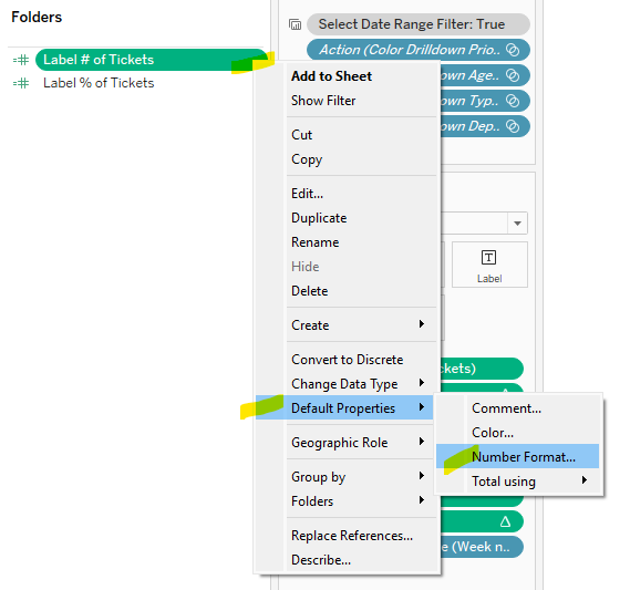
The third option involves one more step but allows you to view the comments without opening the calculation editor dialog box. To follow this method, click on the calculation in the data pane and utilizing the drop-down menu, select Default Properties, Comment. This opens a dialog box where you can add your comments. Best to keep it brief, as these comments will appear when you hover over the calculated field in the data pane.

Voilà! Three easy ways to add notes to help yourself and others when revisions to a workbook are needed (as they often-times are!)

Happy Vizzing, folks!

Proudly powered by WordPress | Theme: Baskerville 2 by Anders Noren.

Up ↑