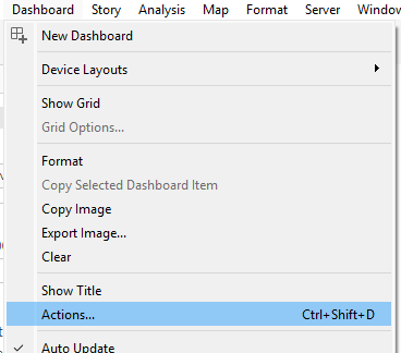
I’ve been wanting to try out one of Tableau’s newer features, rounded corners, so I decided to give one of my very first dashboards a refresh.
Let’s just say… I had a little too much fun with it! 🙂
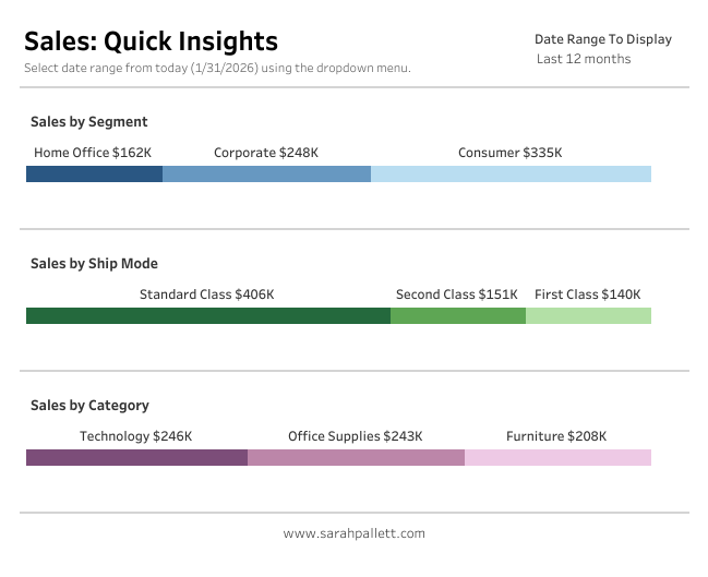
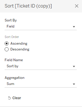
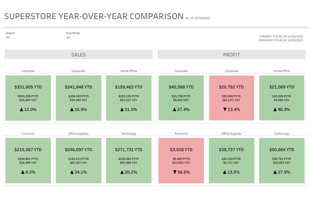
Before
After
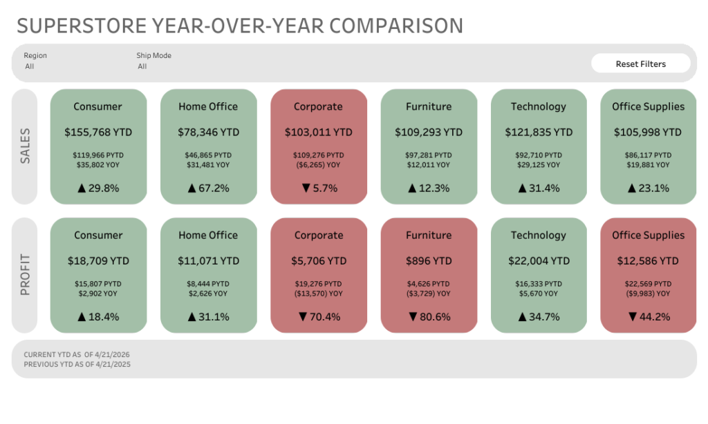
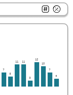
The overall layout is pretty similar, but the feel is completely different. The rounded corners soften everything and make the dashboard feel more modern and a bit more approachable.
Did I go slightly overboard? Maybe. But that’s part of the fun of experimenting with new features.
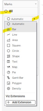
A simple trick I loved:
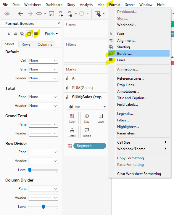
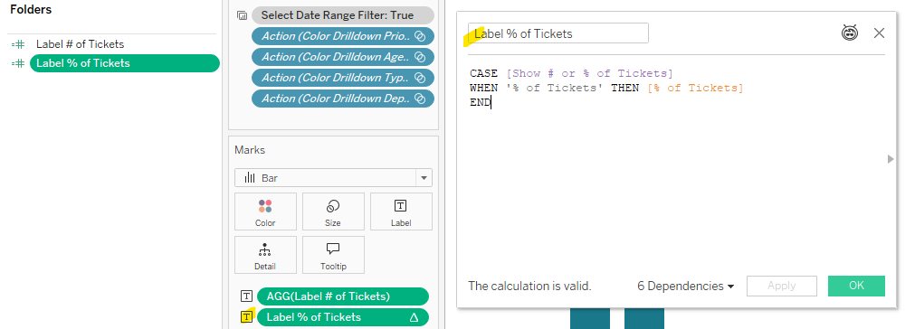
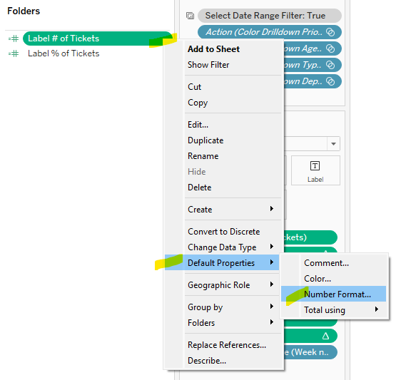
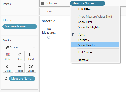
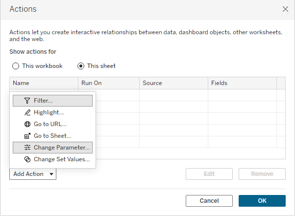
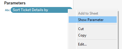
The highlight for me was the “Reset Filters” button.
It looks like a button, but it’s actually just a worksheet. No custom shapes needed.
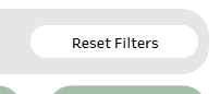
Here’s what I did:
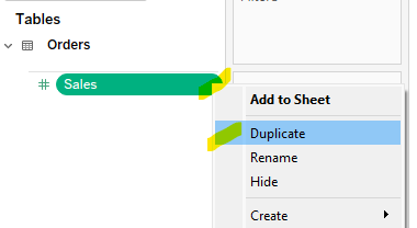
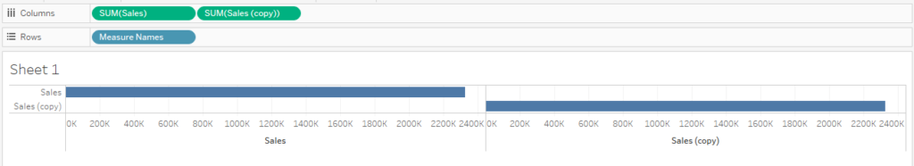
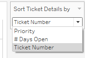
- Created a worksheet with the text “Reset Filters”
- Dropped it onto the dashboard
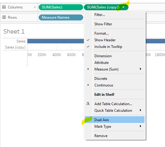
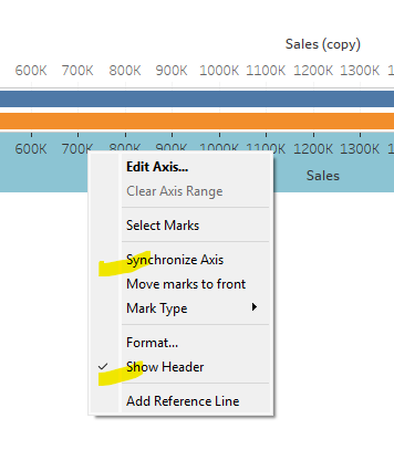
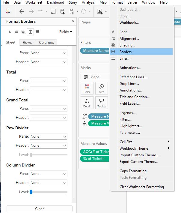
- Layout pane > turned on rounded corners (25 degrees)
- Adjusted the padding and background color
- Added it to the dashboard and set up a dashboard filter action
That’s it. Now it looks and feels like a button, but it’s fully native and easy to maintain.
Why this matters
Small UI details can make a big difference in how a dashboard feels to use. Rounded corners, padding, and subtle styling tweaks can take something from functional to polished without changing the underlying data or logic.
Also… it’s just fun to revisit old work with fresh eyes (and new features).
Curious to hear what others think. Are you using rounded corners yet, or holding onto the classic sharp edges?
Addendum: Why Green & Red?
This design choice actually came from a real client use case.
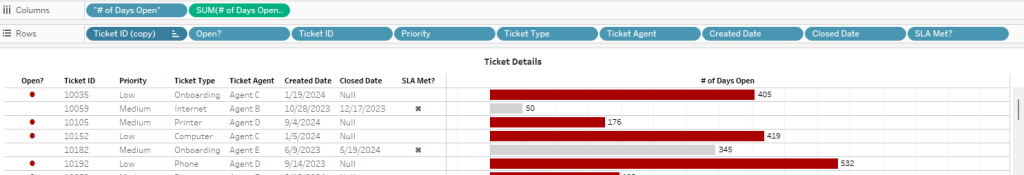
The client felt strongly about using green for positive performance and red for negative performance. The goal of the dashboard was to provide quick, at-a-glance insight info where a segment or category was performing better or worse year over year.
So the color does a lot of the heavy lifting. You can scan the dashboard in seconds and immediately spot what’s up and what needs attention.
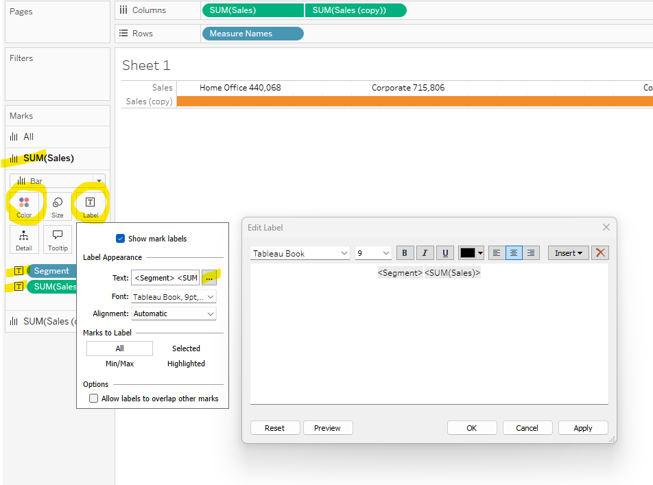
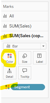
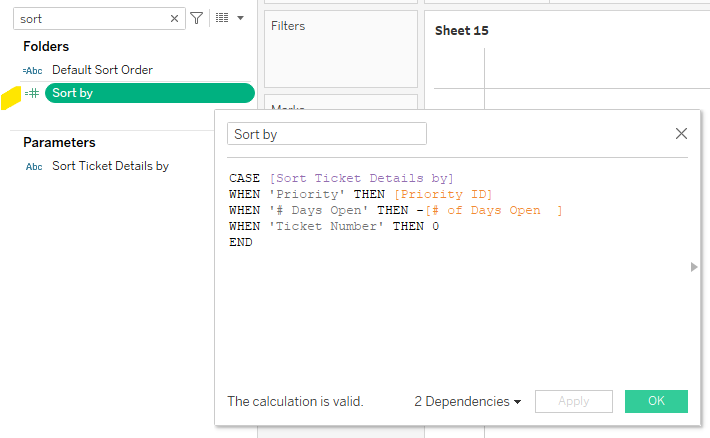
On the technical side, these “cards” are built using a shape mark type with the size maxed out so it fills the entire sheet. Then a simple calculation on color drives whether the mark shows as green or red based on performance.
Simple build, but really effective for this kind of use case.
Feel free to download my workbook and take a look under the hood. You can access it here on my Tableau Public profile.
Happy Vizzing!