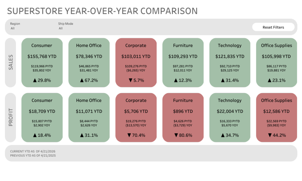
I’ve been wanting to try out one of Tableau’s newer features, rounded corners, so I decided to give one of my very first dashboards a refresh.
Let’s just say… I had a little too much fun with it! 🙂
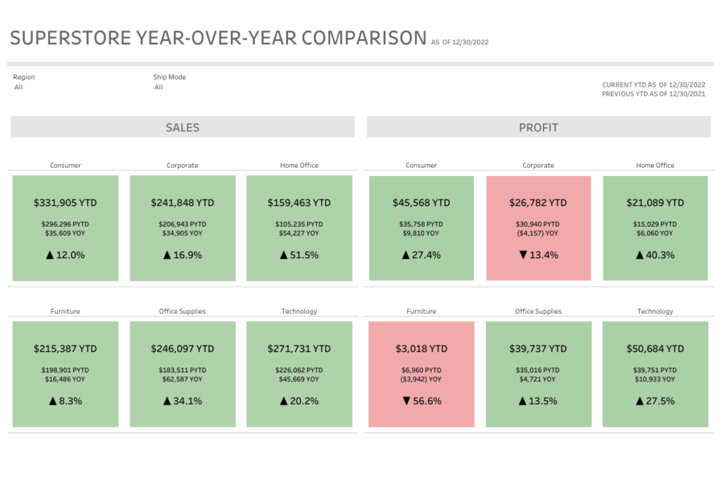
Before
After
The overall layout is pretty similar, but the feel is completely different. The rounded corners soften everything and make the dashboard feel more modern and a bit more approachable.
Did I go slightly overboard? Maybe. But that’s part of the fun of experimenting with new features.
A simple trick I loved:
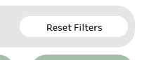
The highlight for me was the “Reset Filters” button.
It looks like a button, but it’s actually just a worksheet. No custom shapes needed.
Here’s what I did:
Created a worksheet with the text “Reset Filters”
Dropped it onto the dashboard
Layout pane > turned on rounded corners (25 degrees)
Adjusted the padding and background color
Added it to the dashboard and set up a dashboard filter action
That’s it. Now it looks and feels like a button, but it’s fully native and easy to maintain.
Why this matters
Small UI details can make a big difference in how a dashboard feels to use. Rounded corners, padding, and subtle styling tweaks can take something from functional to polished without changing the underlying data or logic.
Also… it’s just fun to revisit old work with fresh eyes (and new features).
Curious to hear what others think. Are you using rounded corners yet, or holding onto the classic sharp edges?
Addendum: Why Green & Red?
This design choice actually came from a real client use case.
The client felt strongly about using green for positive performance and red for negative performance. The goal of the dashboard was to provide quick, at-a-glance insight info where a segment or category was performing better or worse year over year.
So the color does a lot of the heavy lifting. You can scan the dashboard in seconds and immediately spot what’s up and what needs attention.
On the technical side, these “cards” are built using a shape mark type with the size maxed out so it fills the entire sheet. Then a simple calculation on color drives whether the mark shows as green or red based on performance.
Simple build, but really effective for this kind of use case.
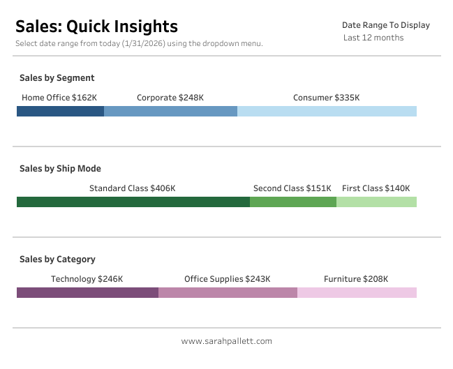
A clean, scannable pattern for quick-insight dashboards
When you need to show how a total breaks down by segment, but don’t want users decoding legends or hovering for context, Labeled Segmented Bars are a great solution.
Also nicknamed At-a-Glance Bars, this pattern combines:
Segmented bars
Direct labels placed above the bar
A clean, minimalist design that reads instantly
This makes them ideal for executive summaries, KPI sections, and overview dashboards where speed and clarity matter.
In this post, I’ll walk through how to build this pattern step-by-step in Tableau.
What Are Labeled Segmented Bars?
A Labeled Segmented Bar uses two synchronized bars layered on top of each other:
A bottom bar that shows segments using color
A top bar that exists purely to display clear, readable labels
Because the labels sit above the segmented bar rather than inside it, insights are immediate, with no legends and no guesswork.
Step-by-Step: How to Build Labeled Segmented Bars
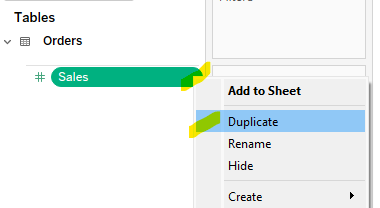
1. Duplicate Your Measure
Start by duplicating the measure you want to visualize.
In this example, I’m using Sales
Create a duplicate field called Sales (Copy)
This duplicate allows us to layer two bars with different formatting.
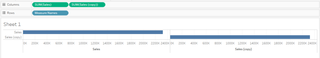
2. Place Both Measures on Columns
Drag Sales to the Columns shelf
Drag Sales (Copy) to the Columns shelf as well
You should now see two bars side by side.
3. Add Measure Names to Rows
Drag Measure Names to the Rows shelf
This helps Tableau manage the layered view once we switch to a dual axis.
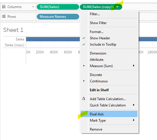
4. Stack the Bars Using Dual Axis
Now we’ll layer the bars on top of each other.
Click the drop-down arrow on Sales (Copy)
Select Dual Axis
You should now see the bars overlapping.
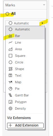
Note: When you select Dual Axis, Tableau will often default the marks to a Circle mark type. If this happens:
Go to the All Marks card
Change the mark type from Automatic to Bar
This ensures both layers render correctly as bars before you continue.
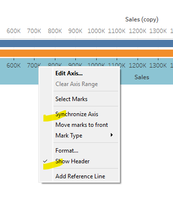
5. Synchronize and Clean the Axis
Right-click on one of the axes → Synchronize Axis
Right-click again → uncheck Show Header
This keeps both bars perfectly aligned and removes unnecessary axis clutter.
Formatting the Bars
At this point, you’ll have three Marks cards:
All
Sales(top bar)
Sales (Copy)(bottom bar)
We’ll use each Marks card intentionally to control the final look.
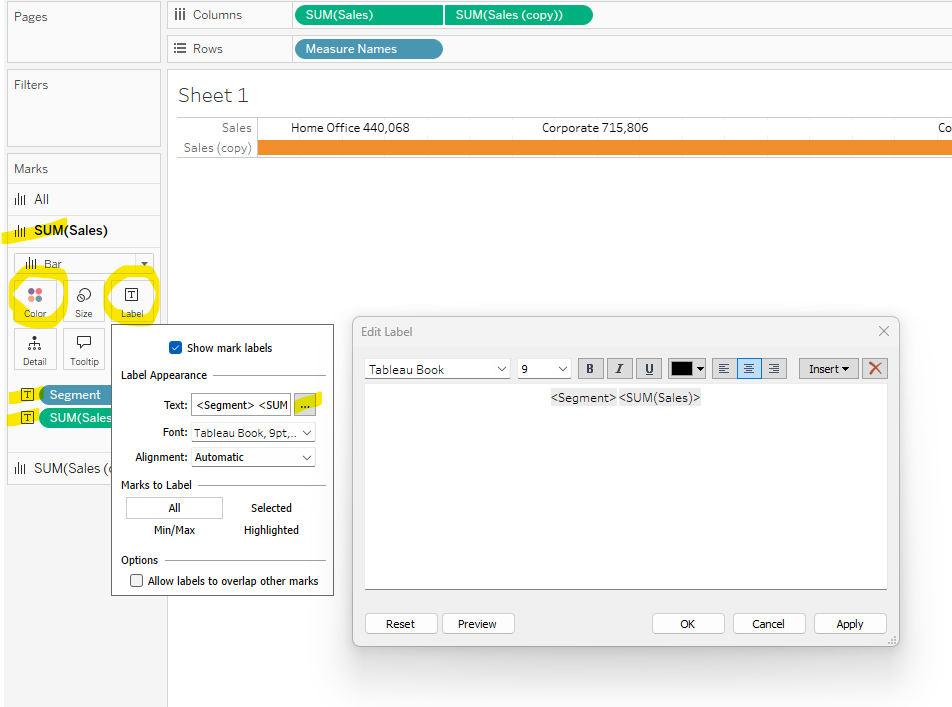
6. Format the Top Bar (Labels Only)
The top bar exists only to display labels.
On the Sales Marks card:
Set Color to White
Remove borders (no outlines)
Add Segment to Label
Add Sales to Label. Remember to format numbers. In this case we want $$ for Sales. Right click on the green pill, select Format and then set the formatting using pane on the left side.
Edit the label text so Segment and Sales appear side by side (Tableau defaults to placing them on separate lines)
This creates clean, readable labels that float above the segmented bar.
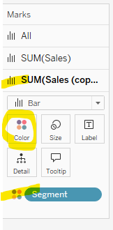
7. Format the Bottom Bar (Segmented Color)
The bottom bar provides the visual segmentation.
On the Sales (Copy) Marks card:
Place Segment on Color
This bar shows the proportional breakdown by segment. Assign a color palette as desired.
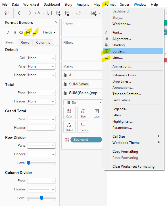
8. Final Formatting Cleanup
For a polished, dashboard-ready finish:
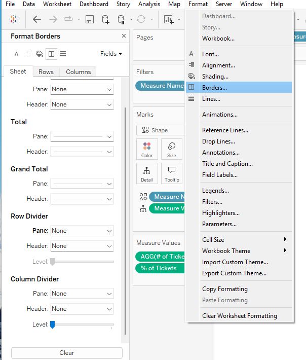
Go to Format → Borders
Remove all row and column borders
Go to Format → Gridlines
Remove all gridlines and dividers
This keeps the focus entirely on the bars and labels.
When to Use This Pattern
Labeled Segmented Bars (At-a-Glance Bars) work best when:
You want users to understand values instantly
It’s important that labels remain readable regardless of color selection
Legends would slow down interpretation
The chart supports a summary or overview, not deep analysis
Common use cases include:
Sales by segment
Revenue by category
Headcount by department
Any “how does this total break down?” question
Final Thoughts
This pattern is simple to build, easy to reuse, and incredibly effective for dashboard communication.
By separating visual segmentation from label readability, Labeled Segmented Bars help users get the message at a glance — exactly what good dashboard design should do.
Over the past few years, I’ve had the opportunity to mentor several early-career Tableau developers through the Data Visualization Society’s mentorship program. It’s one of the most rewarding things I do! Each time a new mentorship cohort begins, I share my go-to resources for learning Tableau, from videos and blogs to books and community programs. Whether you’re just starting out or want to sharpen your skills, here’s what I recommend:
YouTube Channels to Learn Tableau
Short how-to videos are a great way to build confidence and learn new techniques. These are my top three Tableau YouTubers:
Andy Kriebel: Co-founder of #MakeoverMonday and a Tableau Zen Master, Andy’s videos are practical and approachable.
Sqlbelle: Donabel Santos’ tutorials are beginner-friendly and clearly explain key Tableau concepts.
Tableau Tim: Tim’s channel covers a wide range of Tableau topics, from dashboard design to calculated fields to what’s new in the latest release of Tableau.
Blogs, Newsletters & Other Learning Sites
Flerlage Twins: An absolute goldmine of Tableau tutorials, tips, and visual inspiration.
Donna Coles’ Blog: Solutions to many WorkoutWednesday challenges, which are great for learning advanced techniques.
Tableau Bites by Steve Adams at Tableau Training: A curated newsletter that rounds up the latest Tableau news and resources from across the #DataFam.
Books I Recommend
If you prefer learning through books, these are excellent additions to your bookshelf:
Learning Tableau by Joshua N. Milligan – A thorough, accessible introduction that really helps connect the dots.
Tableau Strategies by Ann Jackson & Luke Stanke – Packed with hands-on examples and downloadable datasets.
Data Modeling with Tableau by Kirk Munroe – Helpful for understanding how to structure your data for success.
Tableau Cookbook for Experienced Professionals by Pablo Sáenz de Tejada & Daria Kirilenko – A great reference for seasoned users looking to deepen their skills.
Get Involved in the Tableau Community
The Tableau Community is one of the most welcoming and supportive tech communities out there! Many Tableau User Groups (TUGs) meet virtually and are open to all. Here are a few that stand out:
Analytics Tableau User Group
Tableau Newbies User Group
Career PathMakers
Attending TUGs is a great way to stay inspired and build your network.
Practice Makes Progress: Build Your Portfolio
Participating in Tableau Community Projects is one of the best ways to improve your skills and build a public portfolio. Here are a few I recommend:
WorkoutWednesday – Focuses on technical challenges and advanced techniques
Back2VizBasics – Great for strengthening your foundational skills
MakeoverMonday – Practice redesigning real-world visualizations
All of these come with ready-to-use datasets, so you can dive right in. And don’t forget to explore Tableau Public for inspiration from other data viz creators!
Want to learn more about how community programs can benefit your Tableau journey? Check out my blog post here.
Whether you’re mentoring others or just starting your own Tableau journey, I hope these resources are helpful. Feel free to share your own favorites—I’m always looking to add to this list!
Migrating to Tableau Cloud can unlock powerful new features and scalability, but it’s not just a lift-and-shift. Based on insights from conversations with colleagues like Caroline Fischer, and wisdom shared at TC25 (including the State of Louisiana’s migration journey), here are some key considerations to ensure your move to the cloud is as smooth and strategic as possible.
Real-World Tips from the Field from Caroline
Clean House First: Be ruthless. Multiple audit rounds are worth it. Eliminate tech debt not only in workbooks and data sources, but also consider removing unlicensed users. You will thank yourself later.
Include Your Users and Dashboard Owners: Engage them in assessing what to keep. Leverage usage reports for honest discussions.
Take The Tableau Cloud Migration Technical Readiness Assessment: This will help you identify any existing use cases on Tableau server that need to be adapted prior to migration
Assess the Size of Your Migration and Developer Needs: For small deployments, use the Cloud Migration App. Larger deployments will require the Tableau Migration Software Development Kit (SDK) and developer resources as the SDK requires coding skills.
Plan for Tableau Bridge: If your data lives behind a firewall, Bridge may be essential to maintain live connections or refresh extracts.
Check Inside the Workbooks: Unpublished sheets will surface unexpectedly after migration if not hidden.
Use URL-Based Logos: Image files may not migrate cleanly.
Plan Enough Time For Post Migration Tasks: You will need to update credentials for embedded data sources post migration along with data refresh schedules. If embedding tableau, your code will also require updating.
Update URL Actions: Remember to circle back and update any url actions to other workbooks that used to be housed on server.
Branding Consistency: Check your colors and formatting post-migration.
What Doesn’t Migrate Automatically
It’s important to know up front: several elements won’t carry over in your migration.
Custom Views: Users will need to recreate them manually.
Subscriptions: Users must re-subscribe to dashboards, workbooks, or flows.
Data-Driven Alerts: These will need to be reconfigured post-migration.
Personal Spaces & Favorites: Replace personal spaces with “Personal Projects” and prepare users for the loss of favorites.
URL Actions: Server-specific URLs need to be updated to point to Tableau Cloud.
Saved Credentials: Embedded credentials won’t carry over; you’ll need to update them.
Embedded Solutions: These often require reconfiguration for the Cloud environment.
User Filtering: RLS testing isn’t possible mid-migration. User and group name changes may impact filters.
If you’re consolidating multiple existing sites into fewer ones, use this opportunity to reassess your organizational structure:
Should content be divided into Sites or Projects?
Do current permissions and folders reflect strategy—or legacy habits?
Conduct both a Content Auditand a Structural Audit to optimize for the future.
Communication Is Key
A successful migration isn’t just about the backend work, it’s also about people. Don’t forget to:
Build a communication plan to prepare and train users
Host a Tableau Cloud Readiness Day to educate, energize, and engage your teams
Final Thought: Tableau Cloud migration is as much a chance to clean up, streamline, and modernize your environment as it is a technical lift. Take the time to plan thoughtfully, include users in the process, and treat it as a strategic investment in your data culture.
When I earned my first Tableau certification back in 2020, I didn’t know just how much the Tableau Community would shape my journey. Today, as a Tableau Ambassador and consultant, I can say with confidence: participating in Tableau Community Projects has been one of the most powerful ways to grow my skills, build a network, and create real opportunities in my data career.
Why Tableau Community Projects?
Tableau is a practice profession—you learn best by doing. That’s where community projects come in. These initiatives offer ready-made data sets, creative prompts, and most importantly, a welcoming community of learners and experts.
But the real magic? Consistent participation transforms practice into purpose. Here’s how:
1. Skill Building Through Practice
Community projects like MakeoverMonday, Back2VizBasics, and WorkoutWednesday give you a structured way to sharpen your Tableau skills. Whether you’re focusing on fundamentals or pushing your technical limits, these challenges offer something for everyone.
And because each project comes with a new dataset and task, you’re constantly exposed to different industries, chart types, and data problems—skills that transfer directly to client work or job interviews.
2. Portfolio Power
Before I started consulting, Tableau Public was my resume.
Community projects gave me consistent material to build my portfolio. These projects helped me:
Show off work in interviews
Demo proof-of-concepts to clients
Revisit past work for inspiration
If you’re looking to break into data or level up your current role, a robust, public portfolio is a must—and this is a fun, practical way to build one.
3. Connection & Visibility
One of the best parts of participating in these projects is joining the broader #DataFam.
Every time you publish a viz and share it on social media—especially when you tag project leaders or engage with others’ work—you’re increasing your visibility. Your name starts to show up in newsletters like the #DataFam Weekly Roundup and you might even land a coveted #VizoftheDay feature.
It’s not about going viral—it’s about becoming part of a supportive, vibrant community that notices and celebrates growth.
Share it on social media and tag the project, project leaders, and #Tableau #DataFam to broaden your reach!
And here’s the key: consistency.
Try doing one project a week. Set a regular day and time. Or better yet, find a partner or small group for accountability. Brainstorming together and helping each other get “unstuck” keeps the momentum going.
Final Thoughts
Tableau Community Projects helped me jumpstart my data career and become a fulltime consultant. If you’re looking to grow your skills, get noticed, and have fun doing it—there’s no better place to start. You can check out the community projects I’ve completed here on my Tableau Public profile.
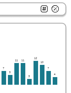
Looking for a simple way to boost interactivity and pack more analytic value into a single bar chart?
In this Help Desk Dashboard, we wanted to track the weekly number of tickets and the percentage each week contributed to the total. At first, we used two separate bar charts, one for the raw counts and one for the percentages, but this felt redundant and took up too much space, especially since the bar sizes were nearly identical. That challenge sparked a creative solution: a single bar chart powered by a parameter action that toggles between ticket count and percent of total.
Adding toggle buttons enhanced the end-user experience – we all love having buttons to press! Read on to learn how to deploy this technique on your dashboards.
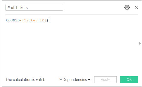
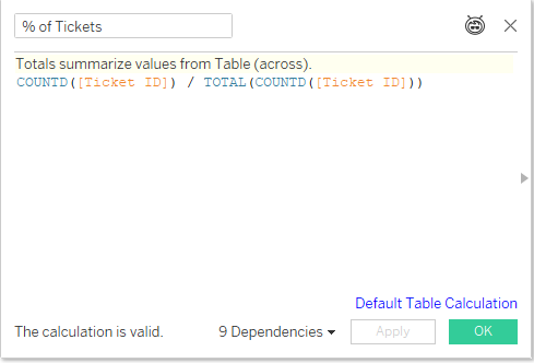
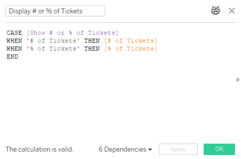
The first step is to identify the two measures. In this example, we needed [ # of Tickets] and [% of Tickets], both of which I chose to set up as calculated fields.
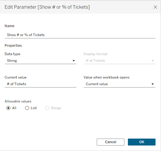
Next, create the [Show # or % of Tickets] parameter that will act as the framework for your toggle. Set it up as an empty string parameter.
Now we are ready to use this parameter in new calculated field. I named it [Display # or % of Tickets]
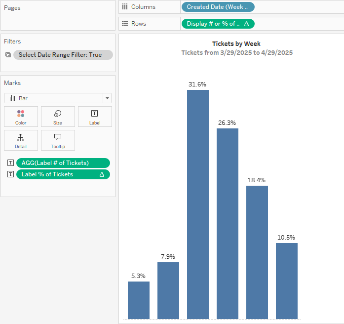
Our next step? Build the bar chart. One a new sheet, bring your date field to columns and the [Display # or % of Tickets] calculation to rows.
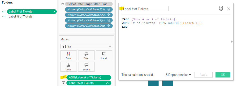
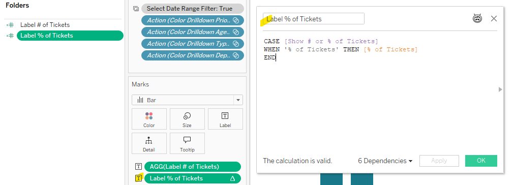
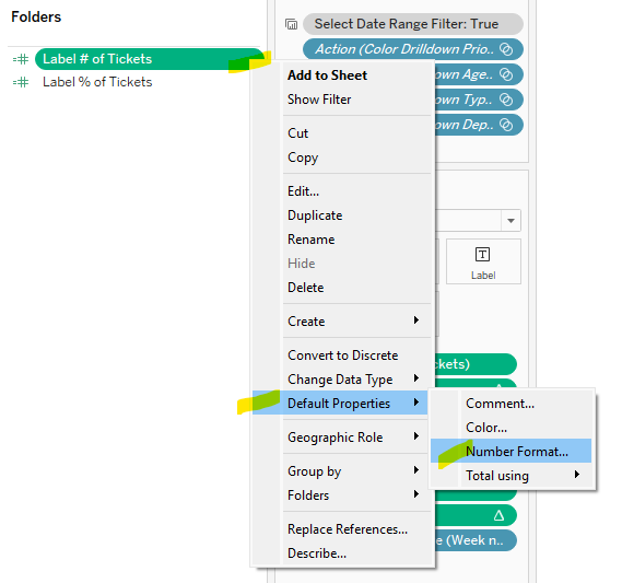
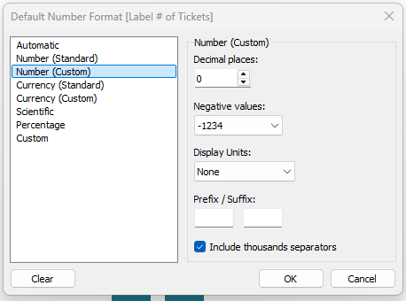
You will notice we used two different calculations on the Text marks card. Unfortunately we cannot use the [Display # or % of Tickets] calculation to display the labels because want to show the # of Tickets as a whole number, and the Percent of Total as a percentage. This means we will need calculations for the labels to allow for custom formatting. Create two new calculations and adjust the Default Properties for each calculation to have the corresponding number formats. These calculations tell Tableau which value to display and the number format to display the value. Place both calculations on the Text Marks Card. I named these calculations [Label # of Tickets] and [Label % of Tickets]
Now we have our parameter, calculations, and bar chart….next up is building the toggle sheet. This may seem tricky, but it’s actually quite straight forward with the use of Measure Names and Measure Values. Follow these steps:
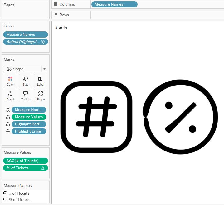
On a new sheet, change the Mark Type of this sheet to Shape.
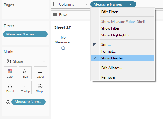
Next, bring Measure Names on to the Filter shelf, and select the two measures used in the toggle [# of Tickets] and [% of Tickets]
Place a second copy of Measure Names on the Shape marks card and a third copy to the Columns Shelf. We won’t need the header, so we can access the drop-down menu and uncheck “Show header” now.
Click on the Shape marks card to select the shapes you wish to use. For the Help Desk Dashboard, I imported custom shapes (Andy Kriebel has a great video on how-to add custom shapes here)
Next, add Measure Values to the Details Shelf. This should only bring two measures into the view because we filtered Measure Names in an earlier step.
Remove the row dividers by accessing Format > Borders, and setting Row Dividers to None.
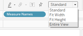
Lastly, set the layout to be Entire View and name the sheet “# or %”
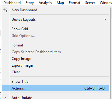
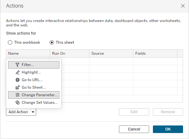
With our bar chart and our # or % toggle sheet ready to go, we can build our dashboard. Go to a new dashboard and drag both sheets on to the dashboard. To enable the interactivity, we need a Dashboard Parameter Action. From the Menu bar, select Dashboard > Actions to open the Actions dialog box.
From the Action drop down menu, select Change Parameter.
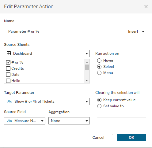
A new dialog box appears to set the configurations for this dashboard action. Give the parameter a meaningful name – I called mine [Parameter # of %]. The source sheet is our Toggle Sheet. We want the action to run on Select. The Target Parameter is our [Show # or % of Tickets] parameter. The source field is Measure Names. We want to Keep the Current Values when Clearing the Selection. Click OK.
Test the parameter action by clicking on one of the custom shapes, and notice if the bar chart labels update. Volia! One bar chart with a toggle for two numerical values. Space-saver and fun interactivity all rolled up into one creative solution! Feel free to take my dashboard for a test drive on Tableau Public, and download it to take a look under the hood if you wish!
Hey #DataFam! Let’s give a warm welcome to our guest blogger this month, Caroline Swiger! We’re excited to feature her fantastic write-up on Custom Themes—a must read! Dive in and enjoy Caroline’s insights!
Save Time with Custom Themes!
Are you constantly looking for ways to save time? I think the answer for most of us is a resounding yes – in life, work, & vizzing! I have been (not-so) patiently waiting for Custom Themes since #TC24, and with Tableau 2025.1, it is finally here! Read on to hear about my first experience with this new feature!
What are themes?
Themes refers to all stylistic and formatting choices made within a workbook. “Themes” have existed in Tableau for some time, but they never really did what people wanted, and have been largely ignored.
Most of my workbooks, particularly at work, begin with time spent formatting the workbook. I change the default font & sizes, turn off grid lines, & turn on a thicker zero line. It is a small investment that saves me time, but one that I repeat for every dashboard. The formatting options at the workbook level are also limited; I always find myself spending considerable time formatting throughout the viz process, from tooltips to charts to the dashboard itself.
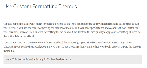
What are Custom Themes?
The Tableau Desktop & Web Authoring guide describes custom themes as the ability to quickly apply formatting choices like fonts and colors to an entire Tableau workbook via a JSON file.
What style elements are supported?
There are 20 style elements available in Tableau that are currently supported for custom themes in Tableau 2025.1. They include:
Style Element
Description
Style Attributes
all
Formats all fonts across the entire workbook.
Font – color
Font – family
worksheet
Formats the worksheet default font.
Font – color
Font – family
Font – size
worksheet-title
Formats the worksheet title font.
Font – color
Font – family
Font – size
tooltip
Formats the tooltip font.
Font – color
Font – family
Font – size
dashboard-title
Formats the dashboard title.
Font – color
Font – family
Font – size
story-title
Formats the story title font.
Font – color
Font – family
Font – size
header
Formats the header font.
Font – color
Font – family
legend
Formats the legend body font & background color.
Font – color
Font – family
Font – size
Background – color
legend-title
Formats the legend title font on all worksheets.
Font – color
Font – family
Font – size
filter
Formats the filter body font & background color on all worksheets.
Font – color
Font – family
Font – size
Background – color
filter-title
Formats the filter title font on all worksheets.
Font – color
Font – family
Font – size
parameter-ctrl
Formats the parameter body font & background color on all worksheets.
Font – color
Font – family
Font – size
Background – color
parameter-ctrl-title
Formats the parameter control title font on all worksheets.
Font – color
Font – family
Font – size
highlighter
Formats the highlighter body font & background color on all worksheets.
Font – color
Font – family
Font – size
Background – color
highlighter-title
Formats the highlighter control title font on all worksheets.
Font – color
Font – family
Font – size
page-ctrl-title
Formats the page card title font on all worksheets.
The Tableau documentation online includes example code that could be used to create the JSON custom theme file. My background is not coding-heavy, so I decided to:
Create a simple viz using style elements supported with custom themes,
Export my own custom theme, &
Import it to a new workbook to see how well it worked!
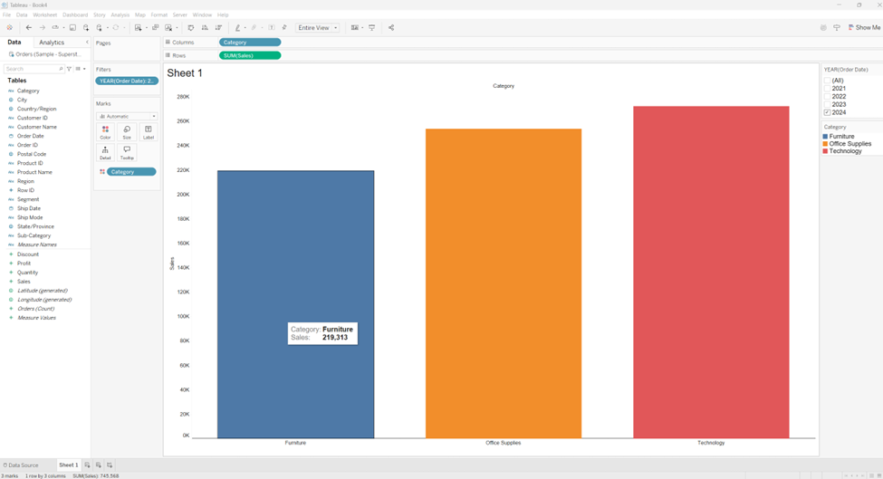
Step 1: Format worksheet
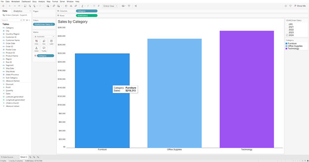
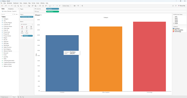
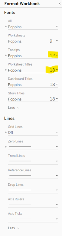
Here is the simple Superstore worksheet I created:
Style choices made at the workbook-level (those supported by custom themes have a ✅!):
Color legend: Title – 11pt✅, #1b1b1b✅; Body – 11pt✅, #1b1b1b✅
Filter and Set Control: Title – 12pt✅, #1b1b1b✅; Body – 11pt✅, #1b1b1b✅
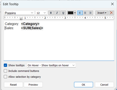
Tooltips: 12pt✅, #1b1b1b✅, Bold variables
Admittedly, this is not an extensive list of formatting choices on my part – just 23; 27 if you include the tab in the tooltip, deselecting the command buttons & allow selection by category options, & choosing to show tooltips on hover. I anticipated that custom themes would cover 17 of them – not too shabby if all went well.
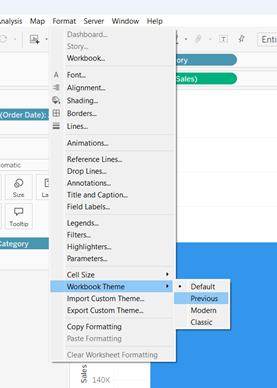
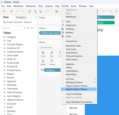
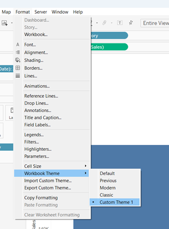
Step 2: Export custom theme
After formatting my worksheet, I went to Format > Export Custom Theme… and saved it in My Tableau Repository as ‘Custom Theme 1.json’ (original 😂).
Step 3: Recreate worksheet in new workbook & import custom theme
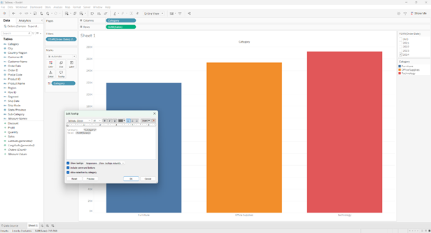
I opened a fresh workbook & recreated the basic view without adjusting any of the default formatting.
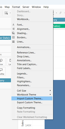
Then, I went to Format > Import Custom Theme… and selected ‘Custom Theme 1.json’ from the list.
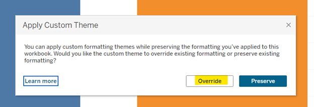
When the Apply Custom Theme message popped up, I clicked Override.
Drum roll, please…
And here is the resulting worksheet with my very first custom theme applied!
So how did it do?
Style Element
Success?
Workbook font = Poppins
✅
Grid lines = off
✅
Zero line = solid
✅
Zero line = 1pt
✅
Zero line = #1b1b1b
✅
Worksheet-title = 18pt
Font size remained default 15pt
Worksheet-title = #1b1b1b
✅
Color legend (title) = 11pt
✅
Color legend (title) = #1b1b1b
✅
Color legend (body) = 11pt
✅
Color legend (body) = #1b1b1b
✅
Filter & set control (title) = 11pt
✅
Filter & set control (title) = #1b1b1b
✅
Filter & set control (body) = 11pt
✅
Filter & set control (body) = #1b1b1b
✅
Tooltip font = 12pt
Font size remained default 10pt
Tooltip font = #1b1b1b
Partial credit? The headers remained the default gray but the variables were #1b1b1b (maybe this is all it applies to?) But extra credit for maintaining my tab! I will take it!
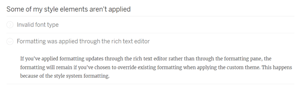
I looked at the troubleshooting guide because it was probably me & not Tableau 😉.
Aha! The key is to use the formatting pane:
I exported & imported again with success! 17/17 expected style elements present!
Hey, look! Now my highly original name for my very first custom theme appears in the list of options! Neat!
Final thoughts
I am excited about the initial release of custom themes and pumped for my organization to upgrade to 2025.1 so I can create my standard template go-to. What may have been 20+ clicks is now just one, and that is awesome.
Custom themes may not be a radical time saver yet, but it has so much potential. Can you imagine if you were able to choose more of your own defaults? Sit down to start a viz and import a theme where all the styling is suited to your preferences, down to the charts? I can hear a choir of angels singing now…
Make your text tables on dashboards shine with an easy, interactive, custom sort order feature.
The concept is simple: give your dashboard viewers a handy-dandy drop-down menu so they can sort their table with the rows of most importance to them at the top. I deployed this technique on my Help Desk Dashboard – click here to see it in action.
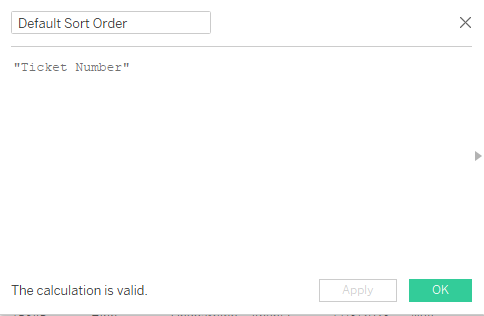
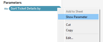
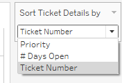
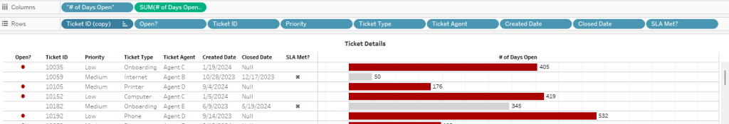
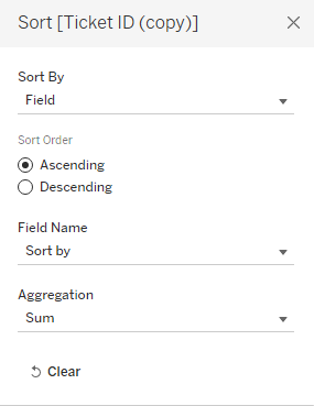
Begin by building your text table and determining the various ways in which the table can be sorted. For my Help Desk Dashboard, I chose Ticket Priority, # of Days Open, and Ticket Number. I also wanted to be sure the table always defaulted to show the rows by Ticket Number when the workbook is opened. Once you’ve established these values, you can create a calculation to set the default value and a parameter with the list of sort options.
Note the Default Sort Order calculation appears in the “Value when workbook opens” spot in the parameter.
Once the parameter is created, you can show the parameter and take a sneak peak at the appearance of the toggle.
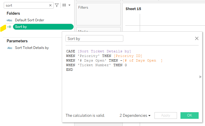
Looks good! We are now ready for our next step, which requires us to use this parameter in a calculation. A CASE statement works beautifully in this step.
With this calculation, we are asking Tableau to do the following:
When the toggle is set to Priority, Tableau will check the Priority ID and sort by this value. For your reference, the Priority ID in this dataset assigns High Priority the value of 20, Medium is 30, and Low is 40. For the rows to be listed from High to Low, we will want to use this calculation in Ascending Order: 20-30-40 (Tuck away that thought for later!)
When the toggle is set to # of Days Open, we want Tableau to reference a calculation by the same name that counts the difference in days between Created Date and Closed Date, or in the case of tickets still open, the difference between Created Date and Today. Now, recall that we will be using this calculation in Ascending Order per the note above regarding Priority. This means we must place a negative sign in front of # of Days Open in order for the tickets with the longest # of days open to appear at the top. For example, if a ticket has been opened for 35 days, it will appear above a ticket that has only been opened for 2 days if we assign it a negative value (ascending order is -35 then -2).
And last but not least, when the toggle is set to Ticket Number, we want Tableau to return a 0. Why? We built our text table with Ticket Number as the first value on the Rows shelf, so Tableau will use this value to sort the orders because our Sort Order calculation assigns a 0 to all rows in this setting.
Last but not least, we need to activate this calculation by accessing the drop-down from the Ticket Number field on the rows shelf > Sort and follow the prompts to select the Sort Order field and Ascending order.
So there you have it – with a couple of calculations and one parameter, you can add interactivity to your text table and give the dashboard viewer the control to see the rows of data in the order most relevant to them!
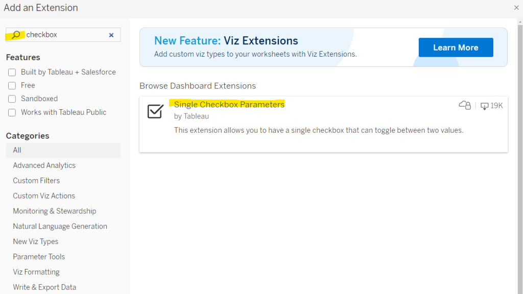
Toggle buttons are a great way to add interactivity to a dashboard, and Tableau’s Single Checkbox Parameter dashboard extension is a quick & easy way to do so!
This got me thinking: if this dashboard extension is new to me, it may be new to others as well. And with that idea, a blog post was born!
Before we jump into the “how-to” part of this blog post, there are two things you should know.
First, a note about the name. “Single Checkbox Parameter” is slightly misleading. It can be a checkbox, but it can also be displayed as a toggle button as shown in Fredrick’s viz and the method I chose for my viz as well. The key point to emphasize is that this extension allows for single selection only, meaning only one item can be true at any given time.
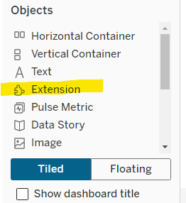
Second, you may be wondering what exactly are dashboard extensions anyway??? Dashboard extensions allow you to add features to a dashboard as you would add standard objects to a dashboard, and can be found in the left bottom corner of the Dashboard pane, under “Objects’.
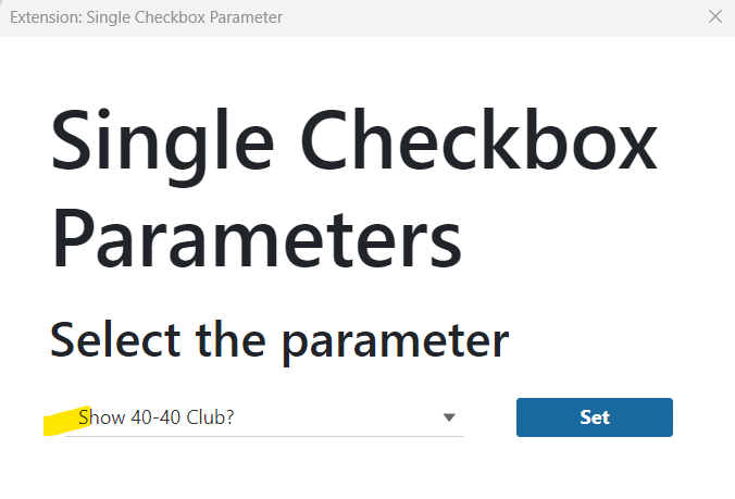
When you drag the Extension object on to a dashboard, a dialog box appears. I used the search box to find the Single Checkbox Parameters extension. Click on this item and follow the prompts to add it to your dashboard.
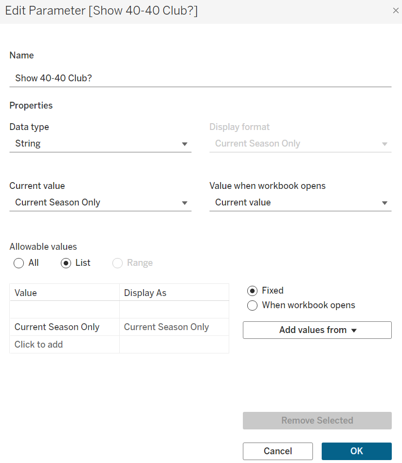
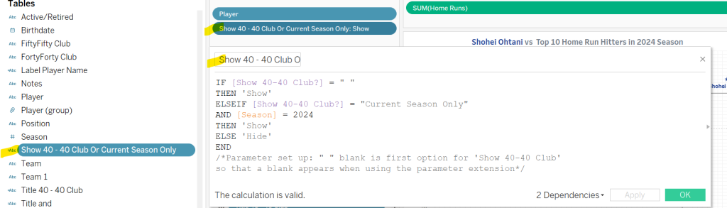
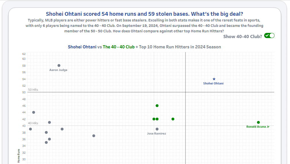
In the case of the Single Checkbox Parameter, you will need a parameter set up before adding the extension to your dashboard. Let’s take a closer look at how I did this for my Ohtani vs Top Home Run Hitters viz. For this dashboard, I wanted the audience to have the ability to show or hide the Top 40 Club. To do this, I created a parameter [Show 40-40 Club?] with a string data type and a specific List of Allowable Values. You’ll notice in this screenshot the first item in my list is actually a space, instead of ‘Show 40-40’. I used a blank space to accommodate formatting choices later on in the design process.
Next, I used this parameter in a calculated field, and placed this calculation on the Filter Shelf set to Show.
With these items in place, I was now ready to add this sheet to my dashboard, along with the Single Checkbox Parameter extension object. Following the prompts, Tableau will ask you to confirm the parameter you wish to use.
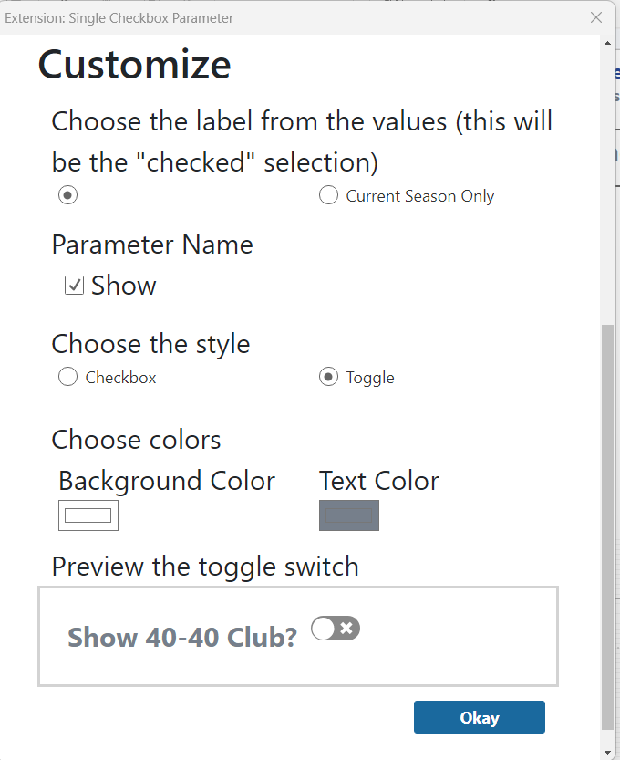
Tableau also provides you with some options to customize the appearance of the extension. This is where you will find the option to choose between the checkbox or the toggle. I chose to display the parameter name, toggle style, and selected a white background with grey text color.
Presto! A toggle button that adds interactivity without having to create a custom shape or image.
Earlier this year, I had the opportunity to take the Databricks Certified Data Analyst Associate exam, and I’m thrilled to share that I passed! Preparing for the exam gave me a chance to strengthen my skills in SQL and deepen my understanding of data storage, cleaning, and shaping.
If you’re looking to expand your skill set in the New Year, read on for my top three tips to help you prepare for and pass the exam.
1. Learn the fundamentals
Everything you need to know is listed here in the exam guide. Databricks recommends registering for Instructor-led training or self-paced training available through their Databricks Academy. I chose to do the self-paced modules and found it extremely helpful.
2. Practice, practice, practice
If you have access to a Sandbox environment, tap into it! This is the fun part of learning – playing with the tool (they call it ‘sandbox’ for a reason!) I also highly recommend taking some practice exams – Udemy has some excellent ones – as this will help you become familiar with the style of questions on the exam. Multiple choice questions can have some tricky wording so a little preparation in this regard can go a long way.
3. Find your tribe
Form a study group with some colleagues or find an accountability study partner to keep you on track. Meet once a week to check-in on progress, share notes, ask clarifying questions. Knowledge sharing in this capacity can lift each other up!
Good luck and be sure to share your badge when you successfully pass the exam. Happy studying, and Happy New Year! May 2025 bring you health, happiness, and all the best data!