Migrating to Tableau Cloud can unlock powerful new features and scalability, but it’s not just a lift-and-shift. Based on insights from conversations with colleagues like Caroline Fischer, and wisdom shared at TC25 (including the State of Louisiana’s migration journey), here are some key considerations to ensure your move to the cloud is as smooth and strategic as possible.
Real-World Tips from the Field from Caroline
- Clean House First: Be ruthless. Multiple audit rounds are worth it. Eliminate tech debt not only in workbooks and data sources, but also consider removing unlicensed users. You will thank yourself later.
- Include Your Users and Dashboard Owners: Engage them in assessing what to keep. Leverage usage reports for honest discussions.
- Take The Tableau Cloud Migration Technical Readiness Assessment: This will help you identify any existing use cases on Tableau server that need to be adapted prior to migration
- Assess the Size of Your Migration and Developer Needs: For small deployments, use the Cloud Migration App. Larger deployments will require the Tableau Migration Software Development Kit (SDK) and developer resources as the SDK requires coding skills.
- Plan for Tableau Bridge: If your data lives behind a firewall, Bridge may be essential to maintain live connections or refresh extracts.
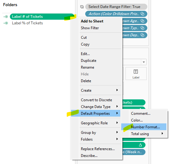
- Check Inside the Workbooks: Unpublished sheets will surface unexpectedly after migration if not hidden.
- Use URL-Based Logos: Image files may not migrate cleanly.
- Plan Enough Time For Post Migration Tasks: You will need to update credentials for embedded data sources post migration along with data refresh schedules. If embedding tableau, your code will also require updating.
- Update URL Actions: Remember to circle back and update any url actions to other workbooks that used to be housed on server.
- Branding Consistency: Check your colors and formatting post-migration.
What Doesn’t Migrate Automatically
It’s important to know up front: several elements won’t carry over in your migration.
- Custom Views: Users will need to recreate them manually.
- Subscriptions: Users must re-subscribe to dashboards, workbooks, or flows.
- Data-Driven Alerts: These will need to be reconfigured post-migration.
- Personal Spaces & Favorites: Replace personal spaces with “Personal Projects” and prepare users for the loss of favorites.
- URL Actions: Server-specific URLs need to be updated to point to Tableau Cloud.
- Saved Credentials: Embedded credentials won’t carry over; you’ll need to update them.
- Embedded Solutions: These often require reconfiguration for the Cloud environment.
- User Filtering: RLS testing isn’t possible mid-migration. User and group name changes may impact filters.
Planning & Scoping the Migration Effort
The TC25 session from the State of Louisiana offered helpful timeframes for scoping:
- <150 items: ~2 weeks
- 150–300 items: 2–3 weeks
- 300–1500 items: 4–12 hours—but requires upfront technical planning
- 1500–3000 items: 3–6 months
- 3000+ items: 6–12 months
Structure Matters: Sites vs Projects
If you’re consolidating multiple existing sites into fewer ones, use this opportunity to reassess your organizational structure:
- Should content be divided into Sites or Projects?
- Do current permissions and folders reflect strategy—or legacy habits?
- Conduct both a Content Audit and a Structural Audit to optimize for the future.
Communication Is Key
A successful migration isn’t just about the backend work, it’s also about people. Don’t forget to:
- Build a communication plan to prepare and train users
- Host a Tableau Cloud Readiness Day to educate, energize, and engage your teams
Final Thought: Tableau Cloud migration is as much a chance to clean up, streamline, and modernize your environment as it is a technical lift. Take the time to plan thoughtfully, include users in the process, and treat it as a strategic investment in your data culture.
Happy Migrating!