Looking for a simple way to boost interactivity and pack more analytic value into a single bar chart?
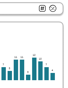
In this Help Desk Dashboard, we wanted to track the weekly number of tickets and the percentage each week contributed to the total. At first, we used two separate bar charts, one for the raw counts and one for the percentages, but this felt redundant and took up too much space, especially since the bar sizes were nearly identical. That challenge sparked a creative solution: a single bar chart powered by a parameter action that toggles between ticket count and percent of total.
Adding toggle buttons enhanced the end-user experience – we all love having buttons to press! Read on to learn how to deploy this technique on your dashboards.
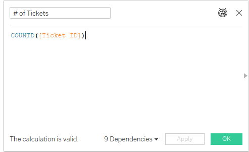
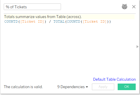
The first step is to identify the two measures. In this example, we needed [ # of Tickets] and [% of Tickets], both of which I chose to set up as calculated fields.
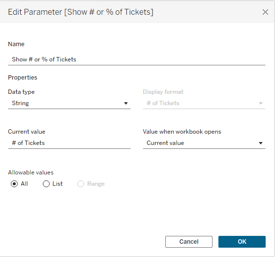
Next, create the [Show # or % of Tickets] parameter that will act as the framework for your toggle. Set it up as an empty string parameter.
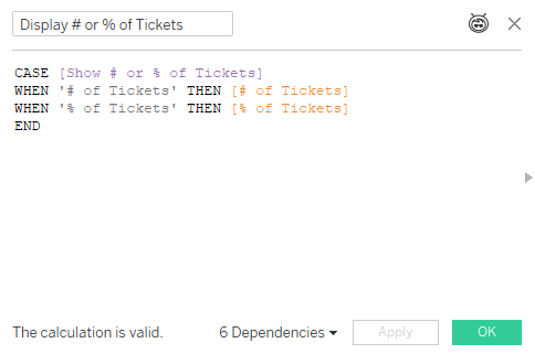
Now we are ready to use this parameter in new calculated field. I named it [Display # or % of Tickets]
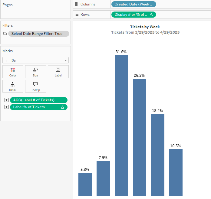
Our next step? Build the bar chart. One a new sheet, bring your date field to columns and the [Display # or % of Tickets] calculation to rows.
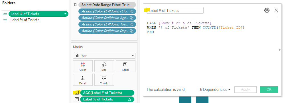
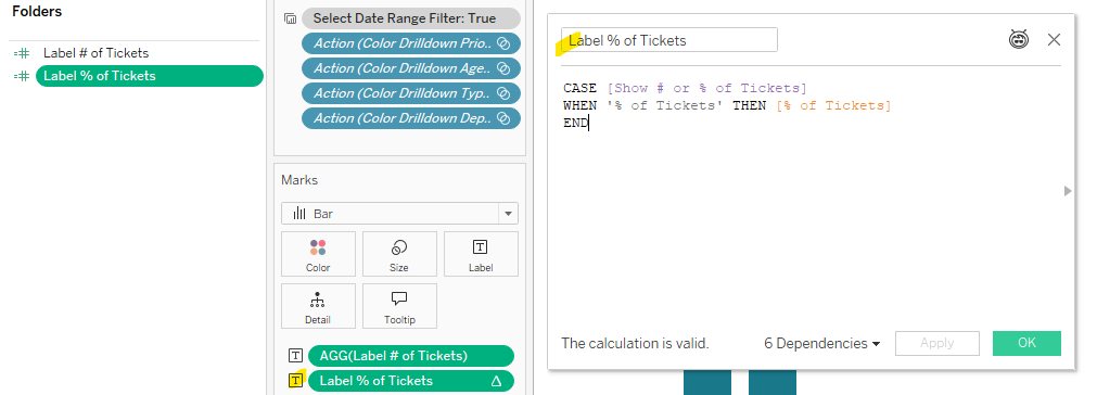
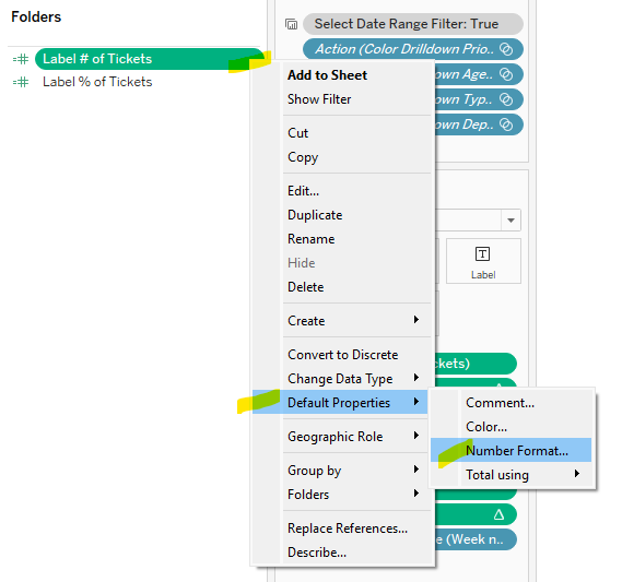
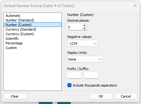
You will notice we used two different calculations on the Text marks card. Unfortunately we cannot use the [Display # or % of Tickets] calculation to display the labels because want to show the # of Tickets as a whole number, and the Percent of Total as a percentage. This means we will need calculations for the labels to allow for custom formatting. Create two new calculations and adjust the Default Properties for each calculation to have the corresponding number formats. These calculations tell Tableau which value to display and the number format to display the value. Place both calculations on the Text Marks Card. I named these calculations [Label # of Tickets] and [Label % of Tickets]
Now we have our parameter, calculations, and bar chart….next up is building the toggle sheet. This may seem tricky, but it’s actually quite straight forward with the use of Measure Names and Measure Values. Follow these steps:
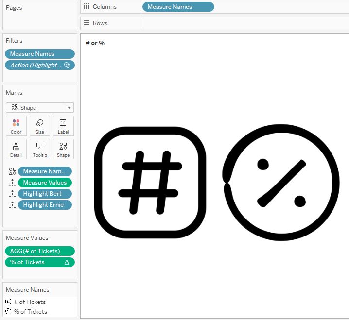
On a new sheet, change the Mark Type of this sheet to Shape.
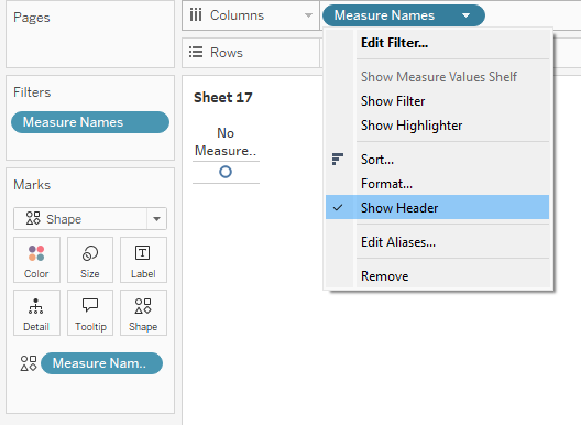
Next, bring Measure Names on to the Filter shelf, and select the two measures used in the toggle [# of Tickets] and [% of Tickets]
Place a second copy of Measure Names on the Shape marks card and a third copy to the Columns Shelf. We won’t need the header, so we can access the drop-down menu and uncheck “Show header” now.
Click on the Shape marks card to select the shapes you wish to use. For the Help Desk Dashboard, I imported custom shapes (Andy Kriebel has a great video on how-to add custom shapes here)
Next, add Measure Values to the Details Shelf. This should only bring two measures into the view because we filtered Measure Names in an earlier step.
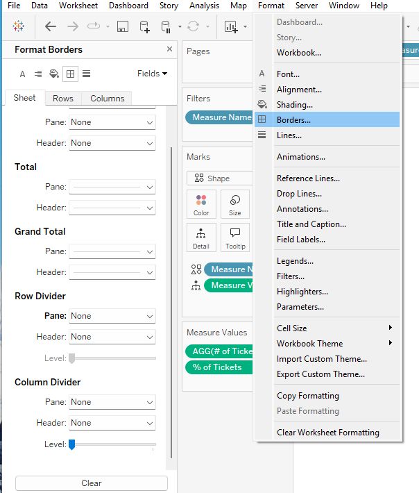
Remove the row dividers by accessing Format > Borders, and setting Row Dividers to None.
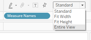
Lastly, set the layout to be Entire View and name the sheet “# or %”
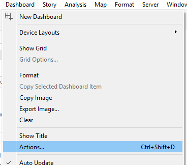
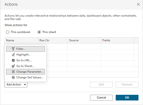
With our bar chart and our # or % toggle sheet ready to go, we can build our dashboard. Go to a new dashboard and drag both sheets on to the dashboard. To enable the interactivity, we need a Dashboard Parameter Action. From the Menu bar, select Dashboard > Actions to open the Actions dialog box.
From the Action drop down menu, select Change Parameter.
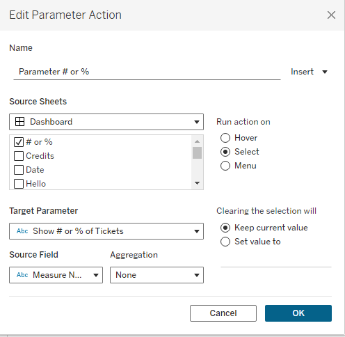
A new dialog box appears to set the configurations for this dashboard action. Give the parameter a meaningful name – I called mine [Parameter # of %]. The source sheet is our Toggle Sheet. We want the action to run on Select. The Target Parameter is our [Show # or % of Tickets] parameter. The source field is Measure Names. We want to Keep the Current Values when Clearing the Selection. Click OK.
Test the parameter action by clicking on one of the custom shapes, and notice if the bar chart labels update. Volia! One bar chart with a toggle for two numerical values. Space-saver and fun interactivity all rolled up into one creative solution! Feel free to take my dashboard for a test drive on Tableau Public, and download it to take a look under the hood if you wish!
Happy Vizzing!