Pep Talk Generator: Life is hard, giving yourself a pep talk doesn’t have to be.

Growing up, my dad gave me the best pep talks. One of his favourties was “Keep your stick on the ice.” Not surprising given his lifelong love of hockey. My Dad passed in 2013, and I miss his pep talks. This pep talk generator helps to partially fill that void, and it is one way I can share the joy he found in lifting others up.

So, let’s get down to the Tableau part, shall we? Building this pep talk generator in Tableau required using a variety of Tableau techniques — here’s a peek under the hood:

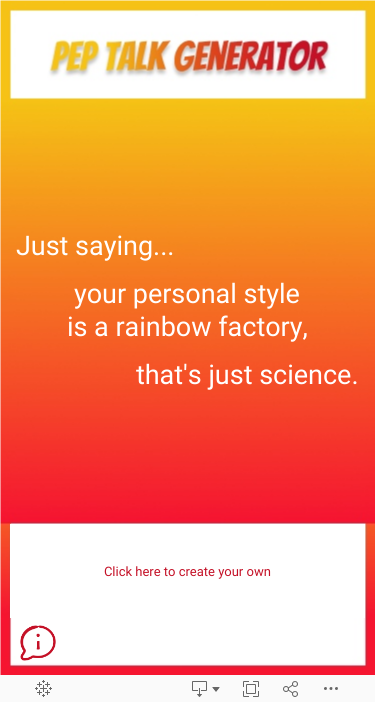
Each pep talk is composed of four separate string values. This gives the dashboard over 100,000 possible pep talk combinations. To offer the choice between the create your own pep talk or randomly generated pep talk, I employed parameters & calculated fields. There are four string calculations for the create your own and another four calculations for the random version.  For those of you keeping score at home, that makes eight calculations.

Pretty straight forward so far, agreed? Feel free to download the workbook from Tableau Public and follow along if you wish!

Both versions of the pep talk generator – create your own and randomly generated – use parameter values in the string calculations to change the text that is shown. Create your own has four parameters, one for each string calculation. Random also has four parameters, one for each string calculation. (Add 8 parameters to the score sheet!) However, the method by which these parameter values are updated differ. Let me explain:

For the Create Your Own version, the values in the parameters are updated using Tableau’s parameter control boxes, which are visible to the dashboard user.  In other words, when the dashboard user interacts with the parameter control box, the value in the parameter changes and updates the string calculation for that portion of the text.

The randomized version also uses four parameters, one for each string calculation, however, these parameters update when the workbook is opened using a different set of calculations. The “default when workbook opens” calculations utilize the function RANDOM() to randomly assign a value between 1-18. 

For those of you keeping score at home, we now have 12 calculations and 8 parameters. Could this be done with fewer calculations? Yes, probably. In fact you could combine the string calculations and thereby reduce the number of calculations, but I prefer having simpler, shorter syntax over nested calculations.

Now that we have the mechanism by which both sets of string calculations will update, and we can use these calculations to build the sheets by placing them on the text marks card. I used two separate sheets, one for the create your own pep talk, and a second one for the random version. I also built two more sheets which I named “button random” and “button create your own” that are used on the dashboard to toggle between the two versions.

You may be wondering how does the dashboard know which sheets to display? Dynamic Zone Visibility and Parameter Actions, FTW!  To employ these techniques, the dashboard utilizes another parameter with two values: Random or Create Your Own, to identify the components needed for each version. The components are as follows:

> four sheets: randomly generated text, create your own text, button random, button create your own

and

> four parameter control boxes that drive the create your own version

On the dashboard, you must assign the “Control visibility using value” to each component, or in the case of the parameter control boxes, the container that holds the components. Lastly, parameter actions drive these components (aka zones) to update dynamically when the dashboard viewer clicks on the “button” sheets. Naturally, there are a few more calculations needed to achieve this functionally, as well calculations for formatting the tooltips – all in, the total number is 22 calculations and 9 parameters! It sounds like a lot, but with consistent naming and a well-laid out plan, the dashboard build is very do-able.

I hope this Pep Talk Generator lifts you up and gives you the motivation to keep going. And if you know someone that needs a pep talk, please pass it on. http://tinyurl.com/peptalkgenerator

Viz built by: Sarah Pallett. Inspiration: David Pallett

Tableau Tip: Download Crosstabs

For folks who download crosstabs from Tableau dashboards, this tip is for you!

To demonstrate this tip, let’s use a simple crosstab with Superstore data.

To begin your download, simply click the download button and select crosstab.

Once you select Crosstab, you are presented with a few additional options: The sheets you wish to download, and a choice between Excel or CSV file formats.

This is where the fun begins! If you select Excel, your download file will be formatted the same way it appears in Tableau. Notice the merged cells in this screenshot:

Alternatively, the CSV format populates each column & each row with the corresponding data. In other words, without merged cells.

Voilà! Two options for downloading crosstabs. If you’d like to take this tip for a test drive, you can find my Tableau workbook published on Tableau Public.

Happy Vizzing!

Tableau Tip: Click Action Tooltips

Did you know there is more than one setting for displaying tooltips?

The default setting, Responsive, triggers the tooltip immediately upon hovering the mouse over the mark in the visualization.

This default setting can be adjusted to Hover, which introduces a slight delay before the tooltip appears. Choosing Hover instructs Tableau to pause briefly before displaying the tooltip popup. This option is particularly useful in visualizations with numerous marks, such as a busy scatterplot, where the Responsive setting may inundate users with tooltips popping up instantly as the mouse moves across the screen.

To switch to the Hover setting, simply click on the dropdown menu within the Tooltips editor box.

But wait, there’s more! There’s a third method to activate tooltips, which I’ve nicknamed “Click Action Tooltips”. This approach involves utilizing a parameter, a handful of calculations, and dashboard parameter actions. Once implemented, tooltips appear when a dashboard user clicks on a mark in the visualization. This is extremely helpful in a crosstab text table with multiple rows of data – no more distracting popups as the mouse scrolls …instead the dashboard user has the control to make the tooltip appear with a simple click action!  Check out my demo dashboard on Tableau Public to take it for a test drive and view how-to-build instructions. Feel free to download & reverse-engineer to make it your own! 

Happy Vizzing! 

Tableau Tip: Formatting Text Tables

Text tables are a common request; often dashboard viewers want to see the rows of data to verify, which in turns builds trust. This is especially true for organizations moving away from traditional spreadsheets to interactive and automated dashboards. Thankfully, there are several techniques that can elevate text tables from good to great, especially when it comes to formatting Sub-Total and Grand Total rows.  Read on to learn three quick & easy techniques.

Rename the header

Click on the Total or Grand Total row and select “Format” from the drop-down menu.  This opens a formatting pane on the left, which allows you to type in a custom header for your Total and/Grand Total rows.  In this example, I’ve renamed Total as Sub-Total, and Grand Total as Total (All Categories). 

Highlight with Color

To draw attention to the total rows, you can customize the shading. To help with comprehension, you can select one color for Sub-Totals, and a different, contrasting color for Grand Totals.

Bold Fonts

Finally, a tried & true method to draw attention to the total rows? Bold the font.

Text tables may not have the pizzaz of a scatterplot or Sankey, but they can still be visually appealing.

Happy Vizzing, folks!

Tableau Tip: Hide the Subtotals

Today’s Tableau Tip comes via WorkoutWednesday – my go-to resource for keeping my Tableau skills topnotch. Without fail, each WOW challenge uncovers a tip or trick, and often there is a practical use-case for those tricks in my daily work.   WOW 2023 Week 39 is the perfect example.  Read on to find out more!

Tables are requested frequently on business dashboards, so I’m always looking for fresh design & format ideas to present the rows of data in a clutter-free way.   In the WOW challenge from Week 39, the requirements called for a column showing $ of sales per subcategory & region with subtotals, and the % of sales by subcategory & region without sub-totals.  Brilliant!  The % subtotal will always be 100%,  so no need to show it every time.  With a little investigating, I found the option to “hide” the subtotals for a single measure in the drop-down menu on the green pill. This allows the subtotal to show for the first measure, and a blank cell to be shown for the second measure.  Here’s a screenshot to illustrate:

The end result is a clean, clutter-free table, with plenty of whitespace to help direct the eye to the numbers of significance.

The tip I’ve outlined in this post is just one of many gems in Week 39’s Challenge. To check out the full solution, see my Tableau Public viz. Shoutout to the WOW Team for continuing to deliver relevant challenges – the #datafam appreciates you!

Happy Vizzing, folks!

Tableau Tip: Add Comments to your Calculations

Recently I inherited a workbook that was a joy to work with – why, you ask? The developer added comments to each calculation, thereby providing explanations to the nuances for each metric.  What a gift!  For today’s Tableau Tip, I will show you three different ways to leverage this technique.

Option 1

In the calculation editor dialog box, add comments by starting the line with two forward slashes, as depicted in this screenshot:

Option 2

The second method is a slight modification of Option 1 and works beautifully when the comment is long & detailed.  Simply begin the comment with one forward slash and an asterisk and complete the comment with an asterisk and a forward slash.

Option 3

The third option involves one more step but allows you to view the comments without opening the calculation editor dialog box. To follow this method, click on the calculation in the data pane and utilizing the drop-down menu, select Default Properties, Comment. This opens a dialog box where you can add your comments. Best to keep it brief, as these comments will appear when you hover over the calculated field in the data pane.

Voilà! Three easy ways to add notes to help yourself and others when revisions to a workbook are needed (as they often-times are!)

Happy Vizzing, folks!

The Value of White Space

I love adding white space or “empty space” to a dashboard. It’s like having a desk that is clean & uncluttered instead of covered in stacks of papers and knick-knacks – it’s peaceful and makes a dashboard feel more “approachable”. It is an under-rated technique that deserves the spotlight.

The September #EduVizzers Challenge on Book Bans was the perfect opportunity to play with this technique, AND the fact that Iron Quest’s White Space Challenge was happening concurrently made the timing ideal. During my development process, I identified 5 distinct metrics that deserved equal attention.  Rather than combining all 5 bar charts in one view, I utilized parameter actions and dynamic zone visibility to allow the end-user to view each chart one at-a-time.  This gave each visual a dedicated space and breathing room to let each metric make a statement.  I know what you’re thinking — in the real world we don’t always have the luxury of showing one chart at a time. Often the visuals need to be side-by-side to assess the metrics in tandem.  In those instances, you can increase the padding around each object.  This is a more subtle way to add white space and one of my default formatting techniques. Outer Padding adds space between two dashboard objects while Inner Padding adds space inside the object’s wireframe. Here’s a screenshot with exaggerated padding to illustrate the difference:

And if you’re curious about school book bans in the US, here’s a viz for you:

Happy Vizzing, and happy white-spacing!

Tableau Tip: Documentation using “Show Caption”

I’m a note-taker — it’s my go-to method for learning and organizing my thoughts. I write to do lists too, but that’s another post. : ) This skill has come in handy recently when I needed to reference a complex Tableau dashboard build from a few months ago. Relying on my memory is sketchy (age, related perhaps?)  – but relying on my notetaking never fails me.  So where does one put notes in a Tableau workbook, so as not to clutter the sheets or dashboards?

If the notes are somewhat lengthy, I recommend utilizing the little-known feature “Show Caption”.  By selecting this from the Worksheet drop-down menu, a box appears at the bottom of your sheet. Tableau automatically populates it with a description of the fields brought into the view.  You can keep this description, or you can Edit the caption to modify it or add your own notes. 

For the workbook I mentioned earlier, I wanted to document the steps I followed to build a drilldown using set actions, so I decided to edit the caption, clear the default description, and add my own. To edit, simply right-click (Control-click on a Mac) in the Caption area and select “Edit Caption”.

This opens an editor dialog box. In this space you can add/remove text and set formatting.

Select Ok once you’ve completed your edits, and the revised caption will appear at the bottom of your sheet.

Viola! Detailed notes at the bottom of your sheet for your future reference, or a delightful surprise when a colleague opens a workbook previously built by you. 

One final note — Captions do not appear by default when sheets are added to dashboards, making them a perfect “behind-the-scenes” spot for notes. Of course, if you wish to display them on a dashboard, it’s a simple as accessing the drop-down menu on the wireframe and checking “Show Caption”.

Happy note-taking! Your future self will thank you.

Tip: Tableau’s “hide data” feature

In this post I’d like to shine a spotlight on Tableau’s “hide data” feature. It’s a hidden gem 🙂 and deserves a shout-out. This feature works beautifully when using Quick Table Calculations such as Percent Difference. Let’s take a closer look.

In this example, the goal is to show monthly sales for the last three months and the % change month-over-month.  To do this, bring the Sales and Date fields into the view and use a continuous date filter to show only the three months desired.

Next, bring a duplicate of Sales into the view and add the Quick Table Calculation for Percent Difference…but notice it is only showing the % change for the last two months, and not the first month in our view. Why? The view doesn’t have any data in the month prior to reference in the table calculation.   Here’s where the fun begins.

Instead of using a continuous date filter, write a calculation that shows only the last three months, and place it on the rows shelf. This returns False for all months prior to the last three months, and True for the last three months.

Next, we need to Hide the False rows. To do this, right-click (control-click on Mac) on the word False in any row and use the menu to select Hide. This tells Tableau to keep the data in the view but hide it from the visual.

Once we’ve completed this step, our view now shows the Percent Difference for ALL three months.  

Finally, we don’t need to show the date filter calculation on rows, so we can uncheck Show Header by accessing the dropdown menu on the blue pill.

Presto! We’ve accomplished our goal to show only the last three months of sales, and the % change month-over-month for all three months.

If you’d like to download the workbook, click on this link to access it on my Tableau Public profile page. Happy Vizzing!

Community Wednesday: A sneak peek into one of our best practices at DataBrains

A quick glance at my calendar reveals a recurring meeting every week named Community Wednesday.  Yes, it’s another zoom call, but it truly stands apart from the rest. 

Originally designed to help grow the skillset of our emerging talent, it has evolved into one of our best practices.  It is a dedicated hour each week for the Tableau Developers at DataBrains to come together to share projects, troubleshoot technical issues, collaborate, brainstorm, and upskill. Sounds like a lot in an hour, doesn’t it? As Brainiacs, the conversation & exchange of ideas moves quickly, making it a fun, fast-paced meeting.

Each week the topic of conversation will vary – some weeks a Brainiac will share a work-in-progress, other weeks we will solve challenges from the wider Tableau Community, namely WorkoutWednesday, Back2VizBasics, and Preppin’ Data.  

Both experienced & emerging talent participate, which allows for the transfer of knowledge in a supportive and collaborative environment. The weekly cadence keeps the discussion relevant, timely, and in sync with client deliverables.  Last but not least of all, it fosters a sense of community among teammates, which Tableau recognizes in the Tableau Blueprint as a core component of successful data-driven organizations.  

I hope this inspires your organization to establish your own best practice to engage & support your Tableau Developers in a collaborative way.  Let your imagination lead the way — how does “New Tip Tuesday” or “Lunch & Learn Fridays” sound?

Proudly powered by WordPress | Theme: Baskerville 2 by Anders Noren.

Up ↑